Brand Guidelines Checklist:
24 Things Every Brand Book Needs
Brand Guidelines Checklist:
24 Things Every Brand Book Needs
Brand Guidelines Checklist:
24 Things Every Brand Book Needs
Published
Published
August 06, 2026
August 06, 2026
Read time
Read time
8 min
8 min
The 24 Items, Grouped
The 24 Items, Grouped
The 24 Items, Grouped
A practical brand guidelines checklist should cover more than logos, colours, and fonts. It needs to give everyone representing the brand enough direction to create consistent work without asking the original designer for help every time.
The 24 items in this brand style guide checklist are organised into six groups:
Brand Foundations — 4 items: mission, positioning, story, and values
Logo Rules — 5 items: logo suite, clear space, minimum size, incorrect usage, and applications
Colour System — 4 items: palettes, colour codes, accessibility, and combinations
Typography — 4 items: typefaces, type scale, licensing, and fallback fonts
Imagery, Icons and Graphic Elements — 4 items: photography, illustration, icons, and layout
Voice, Application and Governance — 3 items: voice, real-world examples, and ownership
These guidelines should work for employees, freelancers, agencies, printers, and partners. Smaller brands may not need extensive documentation for every item, but the core rules should still be defined. Scale the depth of the guidelines to your needs rather than removing essential information.
A practical brand guidelines checklist should cover more than logos, colours, and fonts. It needs to give everyone representing the brand enough direction to create consistent work without asking the original designer for help every time.
The 24 items in this brand style guide checklist are organised into six groups:
Brand Foundations — 4 items: mission, positioning, story, and values
Logo Rules — 5 items: logo suite, clear space, minimum size, incorrect usage, and applications
Colour System — 4 items: palettes, colour codes, accessibility, and combinations
Typography — 4 items: typefaces, type scale, licensing, and fallback fonts
Imagery, Icons and Graphic Elements — 4 items: photography, illustration, icons, and layout
Voice, Application and Governance — 3 items: voice, real-world examples, and ownership
These guidelines should work for employees, freelancers, agencies, printers, and partners. Smaller brands may not need extensive documentation for every item, but the core rules should still be defined. Scale the depth of the guidelines to your needs rather than removing essential information.
Why Brand Guidelines Matter More Than People Expect
Why Brand Guidelines Matter More Than People Expect
Why Brand Guidelines Matter More Than People Expect
Brand guidelines are how an identity survives contact with people who did not design it.
When a brand is new, the original designer or founder may know exactly which logo to use, which font is correct, and how colours should be combined. As more employees, freelancers, agencies, printers, and partners become involved, that knowledge needs to exist somewhere everyone can access.
Without clear guidelines, small inconsistencies quickly multiply.
One vendor uses an outdated logo. Another stretches the logo to fit a layout. A presentation uses the wrong font because nobody can find the licensed files. Social posts introduce new colours, while a printer receives incorrect colour codes. Eventually, several versions of the same brand exist at once.
The cost is not only visual inconsistency. Teams also waste time repeatedly discussing decisions that should already be documented. Designers answer the same questions, marketing teams search for files, and stakeholders re-litigate choices about typography, layouts, and logo usage.
A strong brand guidelines checklist prevents this by turning design decisions into clear, repeatable rules.
If you're deciding what to include in brand guidelines, focus on information that helps someone make the correct decision independently. Useful guidelines do not simply show what the brand looks like—they explain how to reproduce that identity consistently across real situations.
Brand guidelines are how an identity survives contact with people who did not design it.
When a brand is new, the original designer or founder may know exactly which logo to use, which font is correct, and how colours should be combined. As more employees, freelancers, agencies, printers, and partners become involved, that knowledge needs to exist somewhere everyone can access.
Without clear guidelines, small inconsistencies quickly multiply.
One vendor uses an outdated logo. Another stretches the logo to fit a layout. A presentation uses the wrong font because nobody can find the licensed files. Social posts introduce new colours, while a printer receives incorrect colour codes. Eventually, several versions of the same brand exist at once.
The cost is not only visual inconsistency. Teams also waste time repeatedly discussing decisions that should already be documented. Designers answer the same questions, marketing teams search for files, and stakeholders re-litigate choices about typography, layouts, and logo usage.
A strong brand guidelines checklist prevents this by turning design decisions into clear, repeatable rules.
If you're deciding what to include in brand guidelines, focus on information that helps someone make the correct decision independently. Useful guidelines do not simply show what the brand looks like—they explain how to reproduce that identity consistently across real situations.
Brand Foundations (Items 1–4)
Brand Foundations (Items 1–4)
Brand Foundations (Items 1–4)
Before documenting visual rules, establish the strategic foundation behind them. These first four brand book contents give employees and external partners context for why the brand communicates and behaves the way it does.
Before documenting visual rules, establish the strategic foundation behind them. These first four brand book contents give employees and external partners context for why the brand communicates and behaves the way it does.
Mission and Vision
Mission and Vision
Mission and Vision
State what the business exists to do and what future it is working toward. Keep both clear enough that a new employee can understand and repeat them without needing additional explanation.
Avoid long corporate statements filled with abstract language. The mission should guide what the business does now, while the vision describes the longer-term direction.
State what the business exists to do and what future it is working toward. Keep both clear enough that a new employee can understand and repeat them without needing additional explanation.
Avoid long corporate statements filled with abstract language. The mission should guide what the business does now, while the vision describes the longer-term direction.
Positioning Statement and Target Audience
Positioning Statement and Target Audience
Positioning Statement and Target Audience
Document who the brand is for, what category it competes in, the value it provides, and what makes it meaningfully different.
Define the target audience with enough specificity to guide decisions. Knowing the intended customer helps designers, writers, and marketers judge whether their work supports the brand's positioning.
Document who the brand is for, what category it competes in, the value it provides, and what makes it meaningfully different.
Define the target audience with enough specificity to guide decisions. Knowing the intended customer helps designers, writers, and marketers judge whether their work supports the brand's positioning.
Brand Story and Origin
Brand Story and Origin
Brand Story and Origin
Explain where the brand came from, what problem led to its creation, and the ideas that shaped it.
The story does not need to be dramatic. Its purpose is to give teams a shared narrative they can draw from when writing website content, presentations, press materials, and other communications.
Explain where the brand came from, what problem led to its creation, and the ideas that shaped it.
The story does not need to be dramatic. Its purpose is to give teams a shared narrative they can draw from when writing website content, presentations, press materials, and other communications.
Brand Values
Brand Values
Brand Values
List the values that genuinely influence how the company behaves. Each value should include an example of a real decision it would change.
For example, if accessibility is a brand value, it should affect design choices, product decisions, content, and customer experience. If a stated value never changes a decision, it is unlikely to be useful.
Together, these foundations ensure the visual and verbal guidelines connect to the business rather than existing as isolated creative rules.
List the values that genuinely influence how the company behaves. Each value should include an example of a real decision it would change.
For example, if accessibility is a brand value, it should affect design choices, product decisions, content, and customer experience. If a stated value never changes a decision, it is unlikely to be useful.
Together, these foundations ensure the visual and verbal guidelines connect to the business rather than existing as isolated creative rules.
Logo Rules (Items 5–9)
Logo Rules (Items 5–9)
Logo Rules (Items 5–9)
Logo documentation is one of the most important parts of any brand style guide checklist. The goal is not simply to provide logo files, but to explain which version to use, how to use it, and what should never happen to it.
Logo documentation is one of the most important parts of any brand style guide checklist. The goal is not simply to provide logo files, but to explain which version to use, how to use it, and what should never happen to it.
Full Logo Suite
Full Logo Suite
Full Logo Suite
Document every approved logo variation and the purpose of each one. This may include the primary lockup, horizontal and stacked versions, an icon-only mark, wordmark, monochrome version, and reversed version.
Show where each variant works best. A horizontal lockup might suit website headers, while an icon-only mark may be better for social avatars or favicons.
Document every approved logo variation and the purpose of each one. This may include the primary lockup, horizontal and stacked versions, an icon-only mark, wordmark, monochrome version, and reversed version.
Show where each variant works best. A horizontal lockup might suit website headers, while an icon-only mark may be better for social avatars or favicons.
Clear Space
Clear Space
Clear Space
Define the minimum clear space required around the logo so other text, images, or graphic elements do not crowd it.
Express the space using a repeatable ratio based on part of the logo itself—for example, the height of a letter or a specific element of the mark. This makes the rule practical at every size.
Define the minimum clear space required around the logo so other text, images, or graphic elements do not crowd it.
Express the space using a repeatable ratio based on part of the logo itself—for example, the height of a letter or a specific element of the mark. This makes the rule practical at every size.
Minimum Sizes
Minimum Sizes
Minimum Sizes
Set a minimum size for both digital and print applications. A logo that works on a billboard may become unreadable when reduced to a small mobile interface or printed on a compact label.
Different logo variants may require different minimum sizes, so document them separately where necessary.
Set a minimum size for both digital and print applications. A logo that works on a billboard may become unreadable when reduced to a small mobile interface or printed on a compact label.
Different logo variants may require different minimum sizes, so document them separately where necessary.
Incorrect Logo Usage
Incorrect Logo Usage
Incorrect Logo Usage
Do not only explain correct usage. Show clear examples of what not to do.
Include common mistakes such as stretching the logo, changing its colours, rotating it, adding effects, altering proportions, rearranging elements, placing it on low-contrast backgrounds, or recreating the wordmark with another typeface.
Visual do-and-do-not examples make these restrictions much easier to understand than written instructions alone.
Do not only explain correct usage. Show clear examples of what not to do.
Include common mistakes such as stretching the logo, changing its colours, rotating it, adding effects, altering proportions, rearranging elements, placing it on low-contrast backgrounds, or recreating the wordmark with another typeface.
Visual do-and-do-not examples make these restrictions much easier to understand than written instructions alone.
Backgrounds, Images and Co-Branding
Backgrounds, Images and Co-Branding
Backgrounds, Images and Co-Branding
Show how the logo should behave on light backgrounds, dark backgrounds, photography, patterns, and other complex surfaces.
Also document co-branding rules if your logo regularly appears beside partners, sponsors, clients, or parent companies. Define spacing, relative sizing, alignment, and approved lockups so neither brand is represented incorrectly.
Complete logo rules remove guesswork. A useful brand guidelines template should make it possible for someone unfamiliar with the original identity project to select and apply the correct logo confidently.
Show how the logo should behave on light backgrounds, dark backgrounds, photography, patterns, and other complex surfaces.
Also document co-branding rules if your logo regularly appears beside partners, sponsors, clients, or parent companies. Define spacing, relative sizing, alignment, and approved lockups so neither brand is represented incorrectly.
Complete logo rules remove guesswork. A useful brand guidelines template should make it possible for someone unfamiliar with the original identity project to select and apply the correct logo confidently.
Colour System (Items 10–13)
Colour System (Items 10–13)
Colour System (Items 10–13)
Colour guidelines should explain more than which colours belong to the brand. They should define how each colour is used, how it translates across digital and print, and which combinations maintain consistency and accessibility.
Colour guidelines should explain more than which colours belong to the brand. They should define how each colour is used, how it translates across digital and print, and which combinations maintain consistency and accessibility.
Primary, Secondary and Functional Palettes
Primary, Secondary and Functional Palettes
Primary, Secondary and Functional Palettes
Organise your colour system by role. Primary colours should represent the brand most consistently, while secondary colours provide flexibility for campaigns, layouts, and supporting elements.
Functional colours should have specific purposes, such as success, warning, error, or informational states.
Clearly defining these roles prevents teams from treating every colour as interchangeable.
Organise your colour system by role. Primary colours should represent the brand most consistently, while secondary colours provide flexibility for campaigns, layouts, and supporting elements.
Functional colours should have specific purposes, such as success, warning, error, or informational states.
Clearly defining these roles prevents teams from treating every colour as interchangeable.
Complete Colour Codes
Complete Colour Codes
Complete Colour Codes
Document every format required for consistent reproduction.
Your colour codes should include:
HEX for web and digital design
RGB for screen-based applications
CMYK for commercial print
Pantone references where precise print matching is required
Do not assume one value can simply be converted automatically for every medium. Approved specifications help designers and printers reproduce colours more consistently.
Document every format required for consistent reproduction.
Your colour codes should include:
HEX for web and digital design
RGB for screen-based applications
CMYK for commercial print
Pantone references where precise print matching is required
Do not assume one value can simply be converted automatically for every medium. Approved specifications help designers and printers reproduce colours more consistently.
Accessibility and Text Pairings
Accessibility and Text Pairings
Accessibility and Text Pairings
Specify which text and background combinations are approved for use.
Test important combinations against relevant accessibility requirements, including WCAG contrast standards for digital applications. Show examples of approved pairings so designers do not need to test common combinations repeatedly.
This is particularly important for body text, buttons, links, forms, and other functional elements.
Specify which text and background combinations are approved for use.
Test important combinations against relevant accessibility requirements, including WCAG contrast standards for digital applications. Show examples of approved pairings so designers do not need to test common combinations repeatedly.
This is particularly important for body text, buttons, links, forms, and other functional elements.
Colour Combinations, Tints and Shades
Colour Combinations, Tints and Shades
Colour Combinations, Tints and Shades
Document which brand colours can appear together and which combinations should be avoided. Some colours may work individually but create poor contrast or visual imbalance when combined.
Also define approved tints and shades where additional flexibility is required. This prevents teams from creating slightly different versions of brand colours whenever they need a lighter or darker option.
A well-documented colour system keeps the palette consistent while giving teams enough flexibility for real applications.
Document which brand colours can appear together and which combinations should be avoided. Some colours may work individually but create poor contrast or visual imbalance when combined.
Also define approved tints and shades where additional flexibility is required. This prevents teams from creating slightly different versions of brand colours whenever they need a lighter or darker option.
A well-documented colour system keeps the palette consistent while giving teams enough flexibility for real applications.
Typography (Items 14–17)
Typography (Items 14–17)
Typography (Items 14–17)
Typography guidelines turn selected fonts into a repeatable system. A useful brand guidelines checklist should define not only which typefaces to use, but how they create hierarchy and what happens when the preferred fonts are unavailable.
Typography guidelines turn selected fonts into a repeatable system. A useful brand guidelines checklist should define not only which typefaces to use, but how they create hierarchy and what happens when the preferred fonts are unavailable.
Primary and Secondary Typefaces
Primary and Secondary Typefaces
Primary and Secondary Typefaces
Document each approved typeface and its role.
The primary typeface might be used for headings and high-impact messaging, while the secondary typeface handles body copy and longer-form content. If additional fonts are approved for specific purposes, explain exactly where they belong.
Avoid leaving roles open to interpretation. Clear rules reduce unnecessary font combinations across different touchpoints.
Document each approved typeface and its role.
The primary typeface might be used for headings and high-impact messaging, while the secondary typeface handles body copy and longer-form content. If additional fonts are approved for specific purposes, explain exactly where they belong.
Avoid leaving roles open to interpretation. Clear rules reduce unnecessary font combinations across different touchpoints.
Type Scale and Hierarchy
Type Scale and Hierarchy
Type Scale and Hierarchy
Define a consistent type scale for headings, subheadings, body text, captions, labels, and other recurring styles.
Include approved font weights, sizes, line heights, and letter spacing where relevant. Digital guidelines may also need responsive rules so typography scales appropriately between desktop and mobile screens.
A clear hierarchy allows teams to build new layouts without inventing typography rules every time.
Define a consistent type scale for headings, subheadings, body text, captions, labels, and other recurring styles.
Include approved font weights, sizes, line heights, and letter spacing where relevant. Digital guidelines may also need responsive rules so typography scales appropriately between desktop and mobile screens.
A clear hierarchy allows teams to build new layouts without inventing typography rules every time.
Font Licensing and File Location
Font Licensing and File Location
Font Licensing and File Location
Record how each font is licensed, who is permitted to use it, and where approved font files can be found.
This information is easy to overlook but becomes important as the team grows or external partners become involved. Commercial fonts may have different licences for desktop, web, applications, or other uses.
Keep licensing information alongside the relevant assets so teams do not accidentally use fonts outside their permitted terms.
Record how each font is licensed, who is permitted to use it, and where approved font files can be found.
This information is easy to overlook but becomes important as the team grows or external partners become involved. Commercial fonts may have different licences for desktop, web, applications, or other uses.
Keep licensing information alongside the relevant assets so teams do not accidentally use fonts outside their permitted terms.
Fallback and System Font Stack
Fallback and System Font Stack
Fallback and System Font Stack
Your preferred brand typeface may not be available everywhere. Email clients, internal documents, presentations, and some web environments may require a fallback.
Define an approved system font stack that maintains similar proportions and readability when the primary typeface cannot load or be installed.
For example, guidelines can specify the preferred brand font first, followed by approved web-safe alternatives and a generic family.
Including fallback rules in your brand style guide checklist prevents teams from making their own substitutions and keeps typography more consistent across technical environments.
Your preferred brand typeface may not be available everywhere. Email clients, internal documents, presentations, and some web environments may require a fallback.
Define an approved system font stack that maintains similar proportions and readability when the primary typeface cannot load or be installed.
For example, guidelines can specify the preferred brand font first, followed by approved web-safe alternatives and a generic family.
Including fallback rules in your brand style guide checklist prevents teams from making their own substitutions and keeps typography more consistent across technical environments.
Imagery, Icons and Graphic Elements (Items 18–21)
Imagery, Icons and Graphic Elements (Items 18–21)
Imagery, Icons and Graphic Elements (Items 18–21)
A brand can remain recognisable even when its logo is absent if photography, illustration, icons, and graphic elements follow a consistent visual direction.
These elements should therefore be documented with the same care as colour and typography.
A brand can remain recognisable even when its logo is absent if photography, illustration, icons, and graphic elements follow a consistent visual direction.
These elements should therefore be documented with the same care as colour and typography.
Photography Direction
Photography Direction
Photography Direction
Define a clear photography direction covering subject matter, composition, lighting, cropping, perspective, and colour treatment.
Explain what images should feel like as well as what they should contain. For example, a brand might favour natural lighting, candid human moments, close crops, and muted colour grading while avoiding heavily staged stock photography.
Include several approved examples so teams can recognise the intended style quickly.
Define a clear photography direction covering subject matter, composition, lighting, cropping, perspective, and colour treatment.
Explain what images should feel like as well as what they should contain. For example, a brand might favour natural lighting, candid human moments, close crops, and muted colour grading while avoiding heavily staged stock photography.
Include several approved examples so teams can recognise the intended style quickly.
Illustration Style
Illustration Style
Illustration Style
If illustration is part of the identity, define its visual characteristics and when it should be used instead of photography.
Document elements such as line weight, shapes, level of detail, colour usage, perspective, texture, and character style.
Also explain the role illustration plays. It may be used for abstract concepts, educational content, product features, or situations where suitable photography is unavailable.
If illustration is part of the identity, define its visual characteristics and when it should be used instead of photography.
Document elements such as line weight, shapes, level of detail, colour usage, perspective, texture, and character style.
Also explain the role illustration plays. It may be used for abstract concepts, educational content, product features, or situations where suitable photography is unavailable.
Icon System
Icon System
Icon System
Document the rules that keep icons visually consistent.
These can include the underlying grid, stroke weight, corner radius, filled or outlined style, standard sizes, and approved export formats.
If teams can create new icons, provide enough construction guidance for additions to match the existing set. If they cannot, state where approved icons should be sourced.
Document the rules that keep icons visually consistent.
These can include the underlying grid, stroke weight, corner radius, filled or outlined style, standard sizes, and approved export formats.
If teams can create new icons, provide enough construction guidance for additions to match the existing set. If they cannot, state where approved icons should be sourced.
Graphic Devices, Patterns and Layout Grid
Graphic Devices, Patterns and Layout Grid
Graphic Devices, Patterns and Layout Grid
Document supporting visual elements such as patterns, shapes, frames, textures, containers, or other distinctive graphic devices.
Explain how these elements interact with content rather than treating them as decoration.
Guidelines should also define the grid system used to structure layouts, including columns, margins, spacing, and alignment principles where appropriate.
Together, these rules help designers create new materials that feel connected without simply repeating the same layout. They turn the identity into a flexible system that can remain recognisable across websites, presentations, social content, packaging, and campaigns.
Document supporting visual elements such as patterns, shapes, frames, textures, containers, or other distinctive graphic devices.
Explain how these elements interact with content rather than treating them as decoration.
Guidelines should also define the grid system used to structure layouts, including columns, margins, spacing, and alignment principles where appropriate.
Together, these rules help designers create new materials that feel connected without simply repeating the same layout. They turn the identity into a flexible system that can remain recognisable across websites, presentations, social content, packaging, and campaigns.
Voice, Application and Governance (Items 22–24)
Voice, Application and Governance (Items 22–24)
Voice, Application and Governance (Items 22–24)
The final items in a brand guidelines checklist define how the brand communicates, how the identity works across real touchpoints, and who is responsible for keeping the system consistent over time.
The final items in a brand guidelines checklist define how the brand communicates, how the identity works across real touchpoints, and who is responsible for keeping the system consistent over time.
Voice Principles and Tone by Context
Voice Principles and Tone by Context
Voice Principles and Tone by Context
Document the principles that define how the brand sounds. Avoid vague descriptions such as “friendly” or “professional” without explaining what they mean in practice.
For each voice principle, include short do-and-do-not examples. Then show how tone changes depending on context. A sales page may be confident and persuasive, while a customer support message should be clear and reassuring. Error messages may need to be direct and helpful, while social content can allow more personality.
Include sample copy for common situations so writers can see the principles in action.
A complete brand style guide checklist should treat verbal identity as part of the brand system, not an optional addition to the visual guidelines.
Document the principles that define how the brand sounds. Avoid vague descriptions such as “friendly” or “professional” without explaining what they mean in practice.
For each voice principle, include short do-and-do-not examples. Then show how tone changes depending on context. A sales page may be confident and persuasive, while a customer support message should be clear and reassuring. Error messages may need to be direct and helpful, while social content can allow more personality.
Include sample copy for common situations so writers can see the principles in action.
A complete brand style guide checklist should treat verbal identity as part of the brand system, not an optional addition to the visual guidelines.
Applied Examples Across Real Touchpoints
Applied Examples Across Real Touchpoints
Applied Examples Across Real Touchpoints
Guidelines become more useful when people can see how individual rules work together.
Include examples across the touchpoints your organisation uses most often. These might include:
Website pages
Sales and presentation decks
Packaging
Social media
Email signatures
Advertising
Documents
Signage
Applied examples demonstrate how the logo, colour, typography, imagery, voice, and grid system combine in practice.
Choose examples based on actual business needs rather than filling the brand book with idealised mockups that teams rarely produce.
Guidelines become more useful when people can see how individual rules work together.
Include examples across the touchpoints your organisation uses most often. These might include:
Website pages
Sales and presentation decks
Packaging
Social media
Email signatures
Advertising
Documents
Signage
Applied examples demonstrate how the logo, colour, typography, imagery, voice, and grid system combine in practice.
Choose examples based on actual business needs rather than filling the brand book with idealised mockups that teams rarely produce.
Governance, Ownership and Updates
Governance, Ownership and Updates
Governance, Ownership and Updates
Every set of guidelines needs a clear owner.
Document who is responsible for maintaining the system, approving new assets, and answering questions about unusual applications. If someone needs an exception to an existing rule, explain how that request should be made and who can approve it.
Include a version number and review date so employees and external partners can confirm they are using the latest guidelines.
If the guidelines live in a brand portal, establish who can update the source of truth and how changes are communicated. For PDF guidelines, maintain a clear versioning system and archive outdated documents.
Governance is what keeps guidelines useful after delivery. Without ownership, even a comprehensive brand book can gradually become outdated as teams create new assets and requirements change.
Every set of guidelines needs a clear owner.
Document who is responsible for maintaining the system, approving new assets, and answering questions about unusual applications. If someone needs an exception to an existing rule, explain how that request should be made and who can approve it.
Include a version number and review date so employees and external partners can confirm they are using the latest guidelines.
If the guidelines live in a brand portal, establish who can update the source of truth and how changes are communicated. For PDF guidelines, maintain a clear versioning system and archive outdated documents.
Governance is what keeps guidelines useful after delivery. Without ownership, even a comprehensive brand book can gradually become outdated as teams create new assets and requirements change.
How Long Should Brand Guidelines Be?
How Long Should Brand Guidelines Be?
How Long Should Brand Guidelines Be?
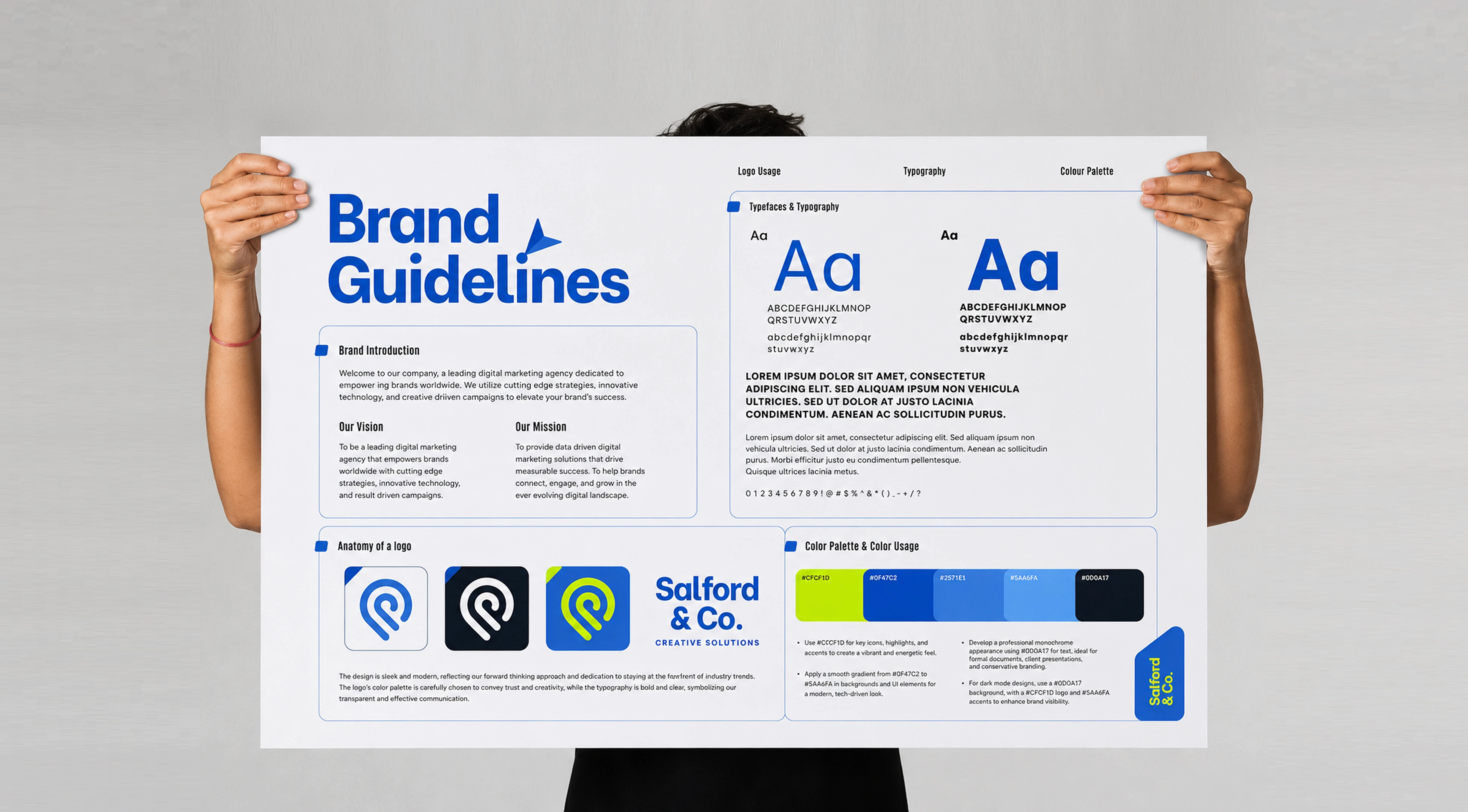
There is no ideal page count for brand guidelines. Their length should reflect the complexity of the identity, the number of people using it, and the variety of touchpoints it needs to support.
A small or early-stage brand may only need around 12–20 pages. A growing organisation with multiple teams may require 30–60 pages or more. Large businesses with several products, markets, sub-brands, or co-branding requirements may need a much larger system or a living brand portal.
Even a lean 12-page document should still cover the essentials:
Brand foundations
Logo variations and usage
Clear space and minimum size
Core colour codes
Accessibility guidance
Typography and hierarchy
Basic imagery direction
Voice principles
Key applied examples
Asset and contact information
The important question is not how many pages you have. It is whether someone can use the document to make correct brand decisions without constantly asking for clarification.
A 100-page brand book filled with inspiration but lacking practical rules can be less useful than a focused 20-page guide with clear examples.
When deciding what to include in brand guidelines, document the decisions that people repeatedly need to make. Add depth where misuse is likely or where applications are complex.
Length is therefore a poor measure of quality. Useful guidelines provide enough information to create consistency without becoming so complicated that nobody uses them.
There is no ideal page count for brand guidelines. Their length should reflect the complexity of the identity, the number of people using it, and the variety of touchpoints it needs to support.
A small or early-stage brand may only need around 12–20 pages. A growing organisation with multiple teams may require 30–60 pages or more. Large businesses with several products, markets, sub-brands, or co-branding requirements may need a much larger system or a living brand portal.
Even a lean 12-page document should still cover the essentials:
Brand foundations
Logo variations and usage
Clear space and minimum size
Core colour codes
Accessibility guidance
Typography and hierarchy
Basic imagery direction
Voice principles
Key applied examples
Asset and contact information
The important question is not how many pages you have. It is whether someone can use the document to make correct brand decisions without constantly asking for clarification.
A 100-page brand book filled with inspiration but lacking practical rules can be less useful than a focused 20-page guide with clear examples.
When deciding what to include in brand guidelines, document the decisions that people repeatedly need to make. Add depth where misuse is likely or where applications are complex.
Length is therefore a poor measure of quality. Useful guidelines provide enough information to create consistency without becoming so complicated that nobody uses them.
PDF Brand Book or Living Brand Portal?
PDF Brand Book or Living Brand Portal?
PDF Brand Book or Living Brand Portal?
The final decision is where your guidelines should live. Both a traditional PDF brand book and a digital brand portal can work, but each has different advantages.
The final decision is where your guidelines should live. Both a traditional PDF brand book and a digital brand portal can work, but each has different advantages.
PDF Brand Book
PDF Brand Book
PDF Brand Book
A PDF is portable, easy to share, printable, and simple to send to freelancers, printers, agencies, and partners. It also creates a fixed record of the identity at a particular point in time.
Its main weakness is version control.
Once PDFs have been downloaded, old copies can remain on computers and shared folders long after an updated version has been released. As the identity evolves, keeping everyone on the latest document becomes harder.
A PDF is portable, easy to share, printable, and simple to send to freelancers, printers, agencies, and partners. It also creates a fixed record of the identity at a particular point in time.
Its main weakness is version control.
Once PDFs have been downloaded, old copies can remain on computers and shared folders long after an updated version has been released. As the identity evolves, keeping everyone on the latest document becomes harder.
Living Brand Portal
Living Brand Portal
Living Brand Portal
A brand portal provides one central location for current guidelines, approved assets, templates, and downloads.
Because updates happen in one place, teams are more likely to work from the latest information. A portal can also grow more easily as new campaigns, products, templates, and rules are introduced.
The trade-off is maintenance. Someone needs to own the portal, keep information current, manage access, and ensure outdated assets are removed.
A brand portal provides one central location for current guidelines, approved assets, templates, and downloads.
Because updates happen in one place, teams are more likely to work from the latest information. A portal can also grow more easily as new campaigns, products, templates, and rules are introduced.
The trade-off is maintenance. Someone needs to own the portal, keep information current, manage access, and ensure outdated assets are removed.
A Hybrid Approach
A Hybrid Approach
A Hybrid Approach
For many organisations, the most practical solution is to use a brand portal as the single source of truth while maintaining an exported PDF for external vendors or situations where offline access is useful.
Whichever format you choose, version control should be explicit. Add version numbers and review dates to PDFs, archive old documents, and make the location of the current guidelines clear.
A good brand guidelines template is only the starting point. The real value comes from creating guidelines that reflect your identity, applications, and team—and keeping them current as the brand evolves.
If you need help turning your identity into a practical system your team can use consistently, explore our brand guidelines design services.
For many organisations, the most practical solution is to use a brand portal as the single source of truth while maintaining an exported PDF for external vendors or situations where offline access is useful.
Whichever format you choose, version control should be explicit. Add version numbers and review dates to PDFs, archive old documents, and make the location of the current guidelines clear.
A good brand guidelines template is only the starting point. The real value comes from creating guidelines that reflect your identity, applications, and team—and keeping them current as the brand evolves.
If you need help turning your identity into a practical system your team can use consistently, explore our brand guidelines design services.
FAQ
FAQ
FAQ
What should brand guidelines include?
What should brand guidelines include?
What should brand guidelines include?
Brand foundations, logo rules, colour system, typography, imagery and iconography, voice and tone, applied examples, and governance covering ownership and version control.
Brand foundations, logo rules, colour system, typography, imagery and iconography, voice and tone, applied examples, and governance covering ownership and version control.
How many pages should brand guidelines be?
How many pages should brand guidelines be?
How many pages should brand guidelines be?
Twelve to twenty pages is enough for most small brands. Larger organisations with print, packaging, retail and product surfaces often need eighty pages or a living portal.
Twelve to twenty pages is enough for most small brands. Larger organisations with print, packaging, retail and product surfaces often need eighty pages or a living portal.
Should brand guidelines be a PDF or a website?
Should brand guidelines be a PDF or a website?
Should brand guidelines be a PDF or a website?
A portal keeps guidance current and is easier to maintain. A PDF is more portable for vendors and printers. Many brands run a portal as the source of truth and export PDFs as needed.
A portal keeps guidance current and is easier to maintain. A PDF is more portable for vendors and printers. Many brands run a portal as the source of truth and export PDFs as needed.
Who writes brand guidelines?
Who writes brand guidelines?
Who writes brand guidelines?
Usually the studio or designer who built the identity, because they can document the reasoning. Brand or marketing then owns and maintains the document afterwards.
Usually the studio or designer who built the identity, because they can document the reasoning. Brand or marketing then owns and maintains the document afterwards.
What is the most commonly missed item in brand guidelines?
What is the most commonly missed item in brand guidelines?
What is the most commonly missed item in brand guidelines?
Governance — naming who owns the document, how exceptions are approved, and when it will be reviewed. Without it, guidelines drift out of date and stop being followed.
Governance — naming who owns the document, how exceptions are approved, and when it will be reviewed. Without it, guidelines drift out of date and stop being followed.
Do brand guidelines need incorrect usage examples?
Do brand guidelines need incorrect usage examples?
Do brand guidelines need incorrect usage examples?
Yes. Showing what not to do prevents far more errors than describing correct usage alone, particularly when external vendors are involved.
Yes. Showing what not to do prevents far more errors than describing correct usage alone, particularly when external vendors are involved.
Recomended blogs
Recomended blogs
Recomended blogs

Brand Identity Design
Brand Identity Design
What Is Brand Identity Design?
The Complete Guide
What Is Brand Identity Design? The Complete Guide
June 24, 2026 | 10 min read
June 24, 2026 | 10 min read


Packaging Design
Brand Identity Design
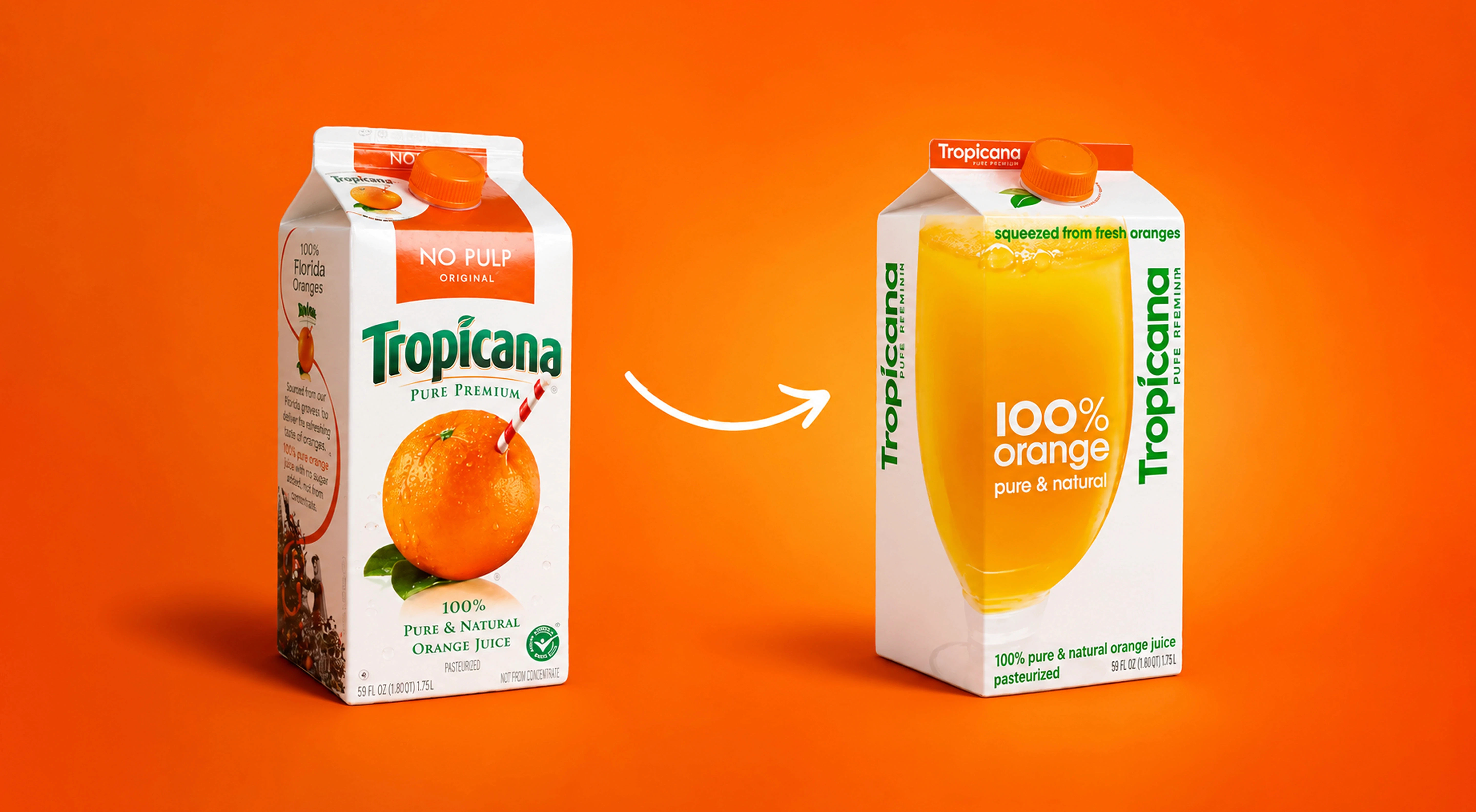
7 Reasons why good design is crucial for brand
Brand Asset Handoff Checklist: What to Deliver and How
June 24, 2021 | 10 min read
June 24, 2026 | 10 min read
Packaging Design
Brand Identity Design
7 Reasons why good design is crucial for brand
Rebranding Mistakes That Destroy Brand Equity
June 24, 2021 | 10 min read
June 24, 2026 | 10 min read
Brand Identity Design
Brand Asset Handoff Checklist:
What to Deliver and How
June 24, 2026 | 10 min read
Need brand guidelines that stay useful beyond the initial handoff?
Need brand guidelines that stay useful beyond the initial handoff?
Need brand guidelines that stay useful beyond the initial handoff?
Get valuable strategy, culture, and brand insights straight to your inbox.
By signing up to receive emails from Abstrct Design, you agree to our Privacy Policy. We treat your info responsibly. Unsubscribe anytime.
© All rights reserved Abstrct Design - 2026
Contact Us
hello@abstrctdesign.com
To Ring
+91 98194 78752
Get valuable strategy, culture, and brand insights straight to your inbox.
By signing up to receive emails from Abstrct Design, you agree to our Privacy Policy. We treat your info responsibly. Unsubscribe anytime.
© All rights reserved Abstrct Design - 2026
Contact Us
hello@abstrctdesign.com
To Ring
+91 98194 78752
Get valuable strategy, culture, and brand insights straight to your inbox.
By signing up to receive emails from Abstrct Design, you agree to our Privacy Policy. We treat your info responsibly. Unsubscribe anytime.
© All rights reserved Abstrct Design - 2026
Contact Us
hello@abstrctdesign.com
To Ring
+91 98194 78752