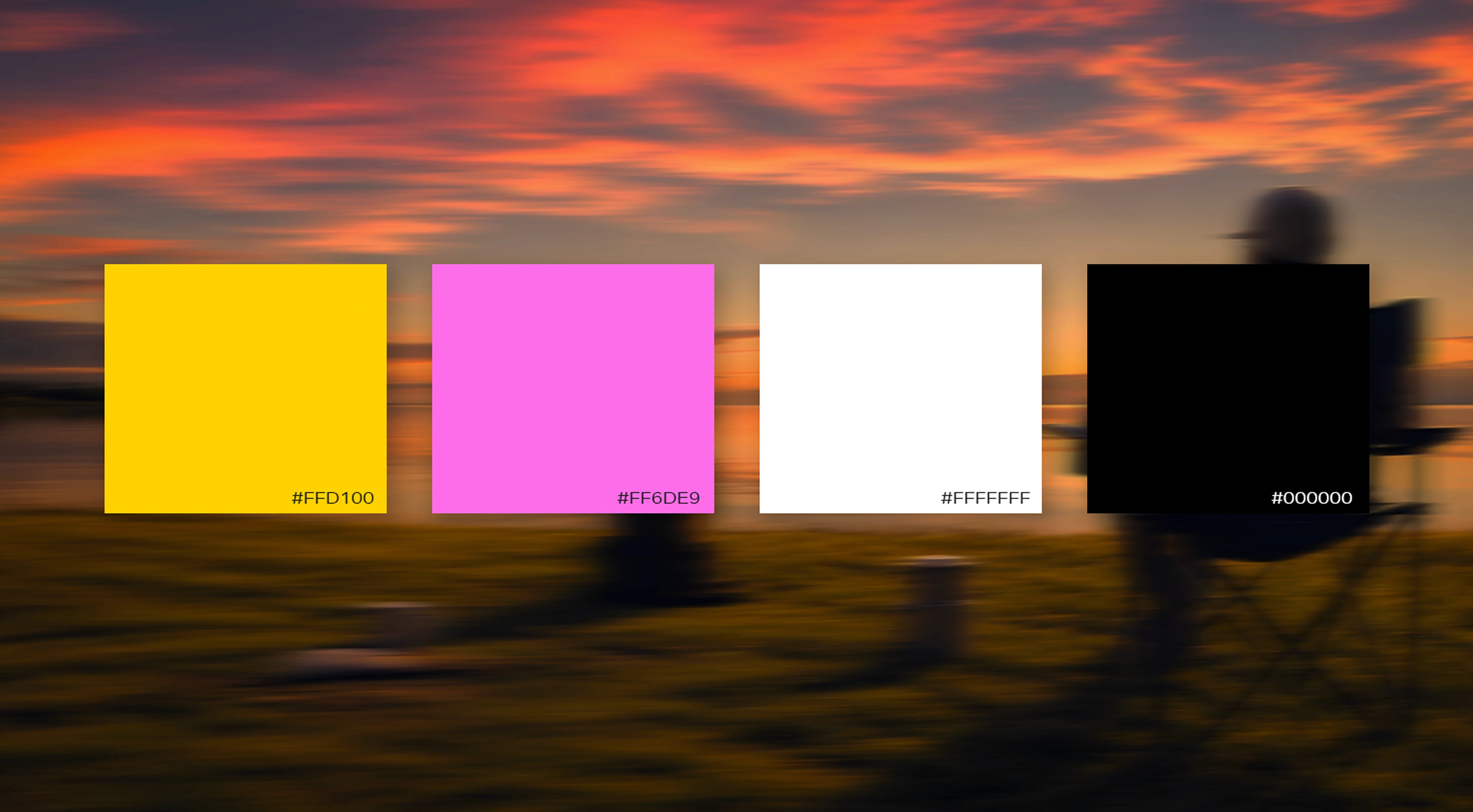
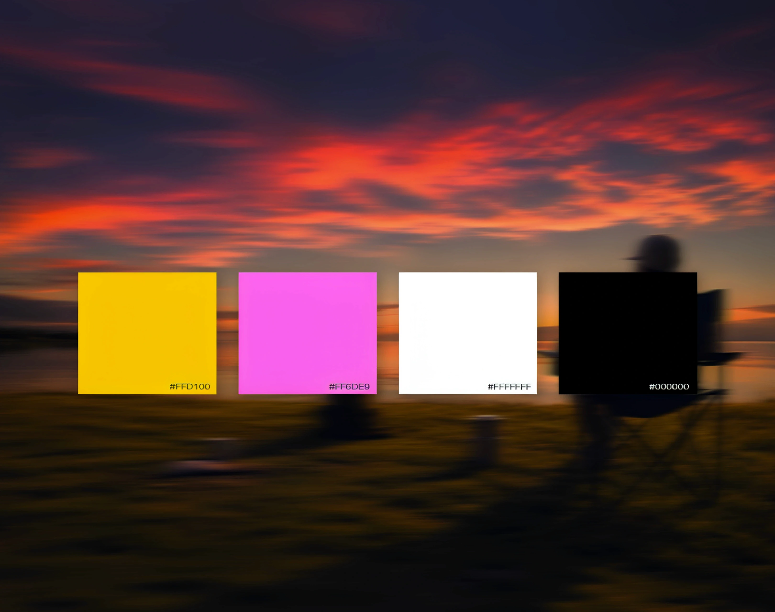

Building a Brand Colour System That Works Everywhere
Building a Brand Colour System That Works Everywhere
Building a Brand Colour System That Works Everywhere
Published
Published
August 06, 2026
August 06, 2026
Read time
Read time
8 min
8 min
A Palette Is Not a System
A Palette Is Not a System
A Palette Is Not a System
A brand colour system is more than a collection of colours that look good together. A palette tells you which colours belong to the brand. A system explains what each colour does, how often it should appear, which combinations are accessible, and how those colours behave across screen, print, product, packaging, and dark mode.
That distinction matters because even a strong palette can become inconsistent without clear rules.
One designer may use the primary colour across an entire layout, while another treats it as an accent. Marketing may introduce new shades for campaigns. Product teams may create separate colours for error states, while printers independently convert digital colours into CMYK.
The original palette has not changed, but the brand starts looking different everywhere.
A practical brand colour palette guide should therefore define:
Primary and secondary colour roles
Neutral and functional colours
Usage ratios
Accessible colour pairings
Tints and shades
Digital and print values
Dark-mode behaviour
Rules for different applications
By the end of this process, every colour should have a defined purpose, specification, and usage rule—not simply a swatch in a brand document.
A brand colour system is more than a collection of colours that look good together. A palette tells you which colours belong to the brand. A system explains what each colour does, how often it should appear, which combinations are accessible, and how those colours behave across screen, print, product, packaging, and dark mode.
That distinction matters because even a strong palette can become inconsistent without clear rules.
One designer may use the primary colour across an entire layout, while another treats it as an accent. Marketing may introduce new shades for campaigns. Product teams may create separate colours for error states, while printers independently convert digital colours into CMYK.
The original palette has not changed, but the brand starts looking different everywhere.
A practical brand colour palette guide should therefore define:
Primary and secondary colour roles
Neutral and functional colours
Usage ratios
Accessible colour pairings
Tints and shades
Digital and print values
Dark-mode behaviour
Rules for different applications
By the end of this process, every colour should have a defined purpose, specification, and usage rule—not simply a swatch in a brand document.
The Tiers of a Brand Colour System
The Tiers of a Brand Colour System
The Tiers of a Brand Colour System
A flexible brand colour system works best when colours are organised by role. Instead of treating every colour equally, divide the palette into primary, secondary, neutral, and functional tiers.
This creates enough variety for real applications without weakening brand recognition.
A flexible brand colour system works best when colours are organised by role. Instead of treating every colour equally, divide the palette into primary, secondary, neutral, and functional tiers.
This creates enough variety for real applications without weakening brand recognition.
Primary Colours
Primary Colours
Primary Colours
Primary colours do most of the identifying work.
For many brands, one dominant colour and one supporting primary colour are enough. These are the colours customers should encounter most consistently across major touchpoints such as the website, packaging, campaigns, presentations, and signage.
Usage ratios help maintain that hierarchy.
For example, if one colour is intended to be dominant, it might account for roughly 60–70% of branded colour usage, with other colours appearing more selectively. The exact percentage is less important than establishing a clear hierarchy.
If every colour appears equally, none of them feels primary.
When deciding how to choose brand colours, ask which colour should become most strongly associated with the brand. Give that colour enough visual presence to build recognition over time.
Primary colours do most of the identifying work.
For many brands, one dominant colour and one supporting primary colour are enough. These are the colours customers should encounter most consistently across major touchpoints such as the website, packaging, campaigns, presentations, and signage.
Usage ratios help maintain that hierarchy.
For example, if one colour is intended to be dominant, it might account for roughly 60–70% of branded colour usage, with other colours appearing more selectively. The exact percentage is less important than establishing a clear hierarchy.
If every colour appears equally, none of them feels primary.
When deciding how to choose brand colours, ask which colour should become most strongly associated with the brand. Give that colour enough visual presence to build recognition over time.
Secondary Colours
Secondary Colours
Secondary Colours
Secondary colours expand the palette without competing with the primary identity.
They can provide variety for campaigns, illustrations, data visualisation, packaging variants, or supporting layouts. However, each secondary colour should have a reason to exist.
An overly broad palette increases the number of possible combinations and makes consistency harder to maintain. If every campaign can choose from ten equally prominent colours, the brand may look different each time.
A practical secondary palette is usually limited enough to remain recognisable but broad enough to solve recurring design needs.
Document when each colour should be used and whether certain secondary colours are reserved for specific applications.
The goal is controlled flexibility—not variety for its own sake.
Secondary colours expand the palette without competing with the primary identity.
They can provide variety for campaigns, illustrations, data visualisation, packaging variants, or supporting layouts. However, each secondary colour should have a reason to exist.
An overly broad palette increases the number of possible combinations and makes consistency harder to maintain. If every campaign can choose from ten equally prominent colours, the brand may look different each time.
A practical secondary palette is usually limited enough to remain recognisable but broad enough to solve recurring design needs.
Document when each colour should be used and whether certain secondary colours are reserved for specific applications.
The goal is controlled flexibility—not variety for its own sake.
Neutrals
Neutrals
Neutrals
Neutrals often do more practical work than the most recognisable brand colours.
Backgrounds, body text, borders, cards, tables, interfaces, and long-form documents all need colours that support the identity without overwhelming the content.
Instead of relying only on pure black and white, create a neutral ramp with several values from light to dark. This provides more control over hierarchy and reduces the need for designers to invent new greys for every layout.
Consider whether warm or cool neutrals better complement the primary palette.
A warm primary palette may work naturally with slightly warm greys, while a cooler identity may benefit from cooler neutral values.
A well-designed neutral range makes the overall brand colour system significantly easier to use in real layouts.
Neutrals often do more practical work than the most recognisable brand colours.
Backgrounds, body text, borders, cards, tables, interfaces, and long-form documents all need colours that support the identity without overwhelming the content.
Instead of relying only on pure black and white, create a neutral ramp with several values from light to dark. This provides more control over hierarchy and reduces the need for designers to invent new greys for every layout.
Consider whether warm or cool neutrals better complement the primary palette.
A warm primary palette may work naturally with slightly warm greys, while a cooler identity may benefit from cooler neutral values.
A well-designed neutral range makes the overall brand colour system significantly easier to use in real layouts.
Functional Colours
Functional Colours
Functional Colours
Functional colours communicate specific states or information rather than brand personality.
Typical roles include:
Success
Warning
Error
Information
These colours are essential for digital products, but they also matter for brands without complex software. Websites have forms and validation messages. Emails contain alerts. Documents, dashboards, and customer communications may all need status colours.
Define functional colours before teams need them.
They should remain distinguishable from one another, maintain appropriate contrast ratios, and work against the surfaces where they will actually appear.
Do not rely on colour alone to communicate meaning. An error state, for example, should combine colour with text, an icon, or another clear indicator.
Defining functional colours as part of the original system prevents teams from inventing inconsistent reds, greens, or yellows later.
Functional colours communicate specific states or information rather than brand personality.
Typical roles include:
Success
Warning
Error
Information
These colours are essential for digital products, but they also matter for brands without complex software. Websites have forms and validation messages. Emails contain alerts. Documents, dashboards, and customer communications may all need status colours.
Define functional colours before teams need them.
They should remain distinguishable from one another, maintain appropriate contrast ratios, and work against the surfaces where they will actually appear.
Do not rely on colour alone to communicate meaning. An error state, for example, should combine colour with text, an icon, or another clear indicator.
Defining functional colours as part of the original system prevents teams from inventing inconsistent reds, greens, or yellows later.
Choosing Colours That Fit the Brand
Choosing Colours That Fit the Brand
Choosing Colours That Fit the Brand
Understanding how to choose brand colours starts with positioning, audience, and context—not personal preference.
A founder liking blue is not a strategic reason to build a blue identity. Likewise, avoiding a colour simply because a competitor uses it may remove an option that customers strongly associate with the category.
Start by asking what the brand needs to communicate and where it needs to compete.
Understanding how to choose brand colours starts with positioning, audience, and context—not personal preference.
A founder liking blue is not a strategic reason to build a blue identity. Likewise, avoiding a colour simply because a competitor uses it may remove an option that customers strongly associate with the category.
Start by asking what the brand needs to communicate and where it needs to compete.
Start With Positioning
Start With Positioning
Start With Positioning
Colour should support the broader positioning of the brand.
A business trying to appear established and dependable may make different choices from one trying to challenge a conservative category. A premium consumer brand may need different visual signals from a high-volume digital service.
The question is not simply, “Which colour represents us?”
Ask instead:
“Which colour system helps us communicate our positioning while remaining distinctive and practical across our most important touchpoints?”
That creates a stronger foundation for colour decisions.
Colour should support the broader positioning of the brand.
A business trying to appear established and dependable may make different choices from one trying to challenge a conservative category. A premium consumer brand may need different visual signals from a high-volume digital service.
The question is not simply, “Which colour represents us?”
Ask instead:
“Which colour system helps us communicate our positioning while remaining distinctive and practical across our most important touchpoints?”
That creates a stronger foundation for colour decisions.
Be Careful With Colour Psychology
Be Careful With Colour Psychology
Be Careful With Colour Psychology
Colour psychology can provide useful context, but it should not be treated as a universal formula.
Statements such as “blue means trust” or “red means excitement” simplify something much more dependent on culture, category, shade, combination, and context.
The same red can communicate urgency in an interface, heritage on packaging, or energy in a sports identity.
Cultural associations also vary significantly between markets.
Use colour psychology as one input—not as proof that a particular colour will create a specific emotional response.
Colour psychology can provide useful context, but it should not be treated as a universal formula.
Statements such as “blue means trust” or “red means excitement” simplify something much more dependent on culture, category, shade, combination, and context.
The same red can communicate urgency in an interface, heritage on packaging, or energy in a sports identity.
Cultural associations also vary significantly between markets.
Use colour psychology as one input—not as proof that a particular colour will create a specific emotional response.
Understand Category Conventions
Understand Category Conventions
Understand Category Conventions
Review how competitors use colour.
Some categories develop strong conventions because those colours help customers understand what kind of product or service they are seeing. Following part of that convention can create familiarity and credibility.
In other cases, breaking the convention can improve distinctiveness.
The decision should depend on what customers need. If unfamiliarity creates confusion, some category cues may be valuable. If competitors have become visually interchangeable, a different approach may create stronger recognition.
Review how competitors use colour.
Some categories develop strong conventions because those colours help customers understand what kind of product or service they are seeing. Following part of that convention can create familiarity and credibility.
In other cases, breaking the convention can improve distinctiveness.
The decision should depend on what customers need. If unfamiliarity creates confusion, some category cues may be valuable. If competitors have become visually interchangeable, a different approach may create stronger recognition.
Test for Distinctiveness
Test for Distinctiveness
Test for Distinctiveness
Remove the logo and look at the colour application on its own.
Does the combination still feel recognisable, or could it belong to almost any competitor?
Distinctiveness does not necessarily require an unusual colour. It can come from a specific combination, proportion, neutral pairing, or consistent use of one dominant colour.
The strongest brand colour palette guide should make colour recognisable through repeated application, not novelty alone.
Remove the logo and look at the colour application on its own.
Does the combination still feel recognisable, or could it belong to almost any competitor?
Distinctiveness does not necessarily require an unusual colour. It can come from a specific combination, proportion, neutral pairing, or consistent use of one dominant colour.
The strongest brand colour palette guide should make colour recognisable through repeated application, not novelty alone.
Test Practical Constraints Early
Test Practical Constraints Early
Test Practical Constraints Early
Finally, test colours where they will actually appear.
A bright digital colour may sit outside the printable colour gamut and shift significantly when reproduced in CMYK. A packaging colour may change depending on substrate and finish. A colour that works in a large graphic may fail as small text. A primary colour may also need adjustment to create accessible brand colours for interfaces.
These are not production details to solve after approval.
A successful brand colour system balances positioning and distinctiveness with the practical reality of how colour behaves across the channels the brand uses every day.
Finally, test colours where they will actually appear.
A bright digital colour may sit outside the printable colour gamut and shift significantly when reproduced in CMYK. A packaging colour may change depending on substrate and finish. A colour that works in a large graphic may fail as small text. A primary colour may also need adjustment to create accessible brand colours for interfaces.
These are not production details to solve after approval.
A successful brand colour system balances positioning and distinctiveness with the practical reality of how colour behaves across the channels the brand uses every day.
Accessibility Is a Design Constraint, Not a Review Step
Accessibility Is a Design Constraint, Not a Review Step
Accessibility Is a Design Constraint, Not a Review Step
Accessibility should shape a brand colour system while it is being created, not become a final check after colours have already been approved.
A colour can be distinctive and visually appealing but still be unsuitable for important digital applications if it does not provide enough contrast.
Under WCAG 2.2 AA, normal body text generally needs a contrast ratio of at least 4.5:1 against its background. Large text requires at least 3:1, while meaningful non-text interface elements such as controls and component boundaries generally require 3:1 against adjacent colours.
Accessibility should shape a brand colour system while it is being created, not become a final check after colours have already been approved.
A colour can be distinctive and visually appealing but still be unsuitable for important digital applications if it does not provide enough contrast.
Under WCAG 2.2 AA, normal body text generally needs a contrast ratio of at least 4.5:1 against its background. Large text requires at least 3:1, while meaningful non-text interface elements such as controls and component boundaries generally require 3:1 against adjacent colours.
Test the Primary Colour Early
Test the Primary Colour Early
Test the Primary Colour Early
A common problem is choosing a primary brand colour that looks strong against white but does not provide enough contrast to support readable text.
That does not necessarily mean the primary colour needs to be removed from the identity.
Instead, the brand colour system can include an accessible variant specifically for text, links, buttons, interactive states, or other functional applications.
For example, a bright primary blue might remain the main identifying colour, while a darker related blue is approved for text and interactive elements where higher contrast is required.
This preserves recognition without sacrificing usability.
A common problem is choosing a primary brand colour that looks strong against white but does not provide enough contrast to support readable text.
That does not necessarily mean the primary colour needs to be removed from the identity.
Instead, the brand colour system can include an accessible variant specifically for text, links, buttons, interactive states, or other functional applications.
For example, a bright primary blue might remain the main identifying colour, while a darker related blue is approved for text and interactive elements where higher contrast is required.
This preserves recognition without sacrificing usability.
Build Approved Colour Pairings
Build Approved Colour Pairings
Build Approved Colour Pairings
Do not expect every designer or developer to test the same combinations repeatedly.
Create a documented matrix showing which foreground and background pairings are approved and their contrast ratios. For example:
Do not expect every designer or developer to test the same combinations repeatedly.
Create a documented matrix showing which foreground and background pairings are approved and their contrast ratios. For example:
Background
Background
Text/Element
Text/Element
Contrast Ratio
Contrast Ratio
Use
Use
White
Primary dark
7.2:1
Approved
Primary dark
White
7.2:1
Approved
Primary bright
White
3.1:1
Large text only
Secondary light
White
1.8:1
Do not use
Background
Text/Element
Contrast Ratio
Use
White
Primary dark
7.2:1
Approved
Primary dark
White
7.2:1
Approved
Primary bright
White
3.1:1
Large text only
Secondary light
White
1.8:1
Do not use
The actual ratios will depend on your colours, but documenting them turns accessible brand colours into a repeatable system.
The actual ratios will depend on your colours, but documenting them turns accessible brand colours into a repeatable system.
Never Communicate Meaning Through Colour Alone
Never Communicate Meaning Through Colour Alone
Never Communicate Meaning Through Colour Alone
Colour can reinforce meaning, but it should not be the only indicator.
An error message should not simply turn red. Add explanatory text, an icon, or another visible signal. The same principle applies to success states, warnings, charts, forms, and interactive controls.
Accessibility is therefore not about creating a separate version of the brand. It is about building usability into the original system so the identity can work for more people across real digital environments.
Colour can reinforce meaning, but it should not be the only indicator.
An error message should not simply turn red. Add explanatory text, an icon, or another visible signal. The same principle applies to success states, warnings, charts, forms, and interactive controls.
Accessibility is therefore not about creating a separate version of the brand. It is about building usability into the original system so the identity can work for more people across real digital environments.
Colour Codes: What You Actually Need and Why
Colour Codes: What You Actually Need and Why
Colour Codes: What You Actually Need and Why
A reliable brand colour system needs documented values for every medium where the identity will appear.
The same colour cannot be represented identically by every screen, printer, ink, or material. That is why complete brand colour codes include specifications for both digital and physical reproduction.
A reliable brand colour system needs documented values for every medium where the identity will appear.
The same colour cannot be represented identically by every screen, printer, ink, or material. That is why complete brand colour codes include specifications for both digital and physical reproduction.
HEX and RGB for Digital Use
HEX and RGB for Digital Use
HEX and RGB for Digital Use
HEX values are commonly used in websites, interfaces, and other digital design environments.
A HEX value might appear as:
#2457FF
RGB describes colour through red, green, and blue values and is also intended for screen-based applications.
For example:
RGB 36, 87, 255
Both describe colours produced through light rather than physical ink.
HEX values are commonly used in websites, interfaces, and other digital design environments.
A HEX value might appear as:
#2457FF
RGB describes colour through red, green, and blue values and is also intended for screen-based applications.
For example:
RGB 36, 87, 255
Both describe colours produced through light rather than physical ink.
CMYK for Process Printing
CMYK for Process Printing
CMYK for Process Printing
CMYK uses cyan, magenta, yellow, and black inks to reproduce colour in commercial printing.
Digital RGB colours can contain brightness or saturation that process printing cannot reproduce. When those colours are converted into CMYK, they may appear duller or shift noticeably.
That is why a brand should establish approved CMYK values rather than allowing every printer or designer to perform their own automatic conversion.
Test the conversion, adjust it deliberately, and document the approved result.
CMYK uses cyan, magenta, yellow, and black inks to reproduce colour in commercial printing.
Digital RGB colours can contain brightness or saturation that process printing cannot reproduce. When those colours are converted into CMYK, they may appear duller or shift noticeably.
That is why a brand should establish approved CMYK values rather than allowing every printer or designer to perform their own automatic conversion.
Test the conversion, adjust it deliberately, and document the approved result.
Pantone for Controlled Colour Matching
Pantone for Controlled Colour Matching
Pantone for Controlled Colour Matching
Pantone spot colours can be useful when tighter physical colour consistency is important.
Rather than reproducing a colour through four-colour process printing, a specified spot ink can provide a more controlled reference for printers and production vendors.
Pantone does not eliminate every variation. Paper stock, finish, ink coverage, lighting, and production methods can still affect appearance. But an agreed reference can improve consistency across suppliers.
Pantone spot colours can be useful when tighter physical colour consistency is important.
Rather than reproducing a colour through four-colour process printing, a specified spot ink can provide a more controlled reference for printers and production vendors.
Pantone does not eliminate every variation. Paper stock, finish, ink coverage, lighting, and production methods can still affect appearance. But an agreed reference can improve consistency across suppliers.
Document Every Approved Value
Document Every Approved Value
Document Every Approved Value
A practical specification table might include:
A practical specification table might include:
Colour
Colour
HEX
HEX
RGB
RGB
CMYK
CMYK
Pantone
Pantone
Primary Use
Primary Use
Brand Primary
Defined value
Defined value
Defined value
Reference
Identity
Brand Secondary
Defined value
Defined value
Defined value
Reference
Supporting
Neutral Dark
Defined value
Defined value
Defined value
If needed
Text
Error
Defined value
Defined value
Defined value
Usually optional
Functional
Colour
HEX
RGB
CMYK
Pantone
Primary Use
Brand Primary
Defined value
Defined value
Defined value
Reference
Identity
Brand Secondary
Defined value
Defined value
Defined value
Reference
Supporting
Neutral Dark
Defined value
Defined value
Defined value
If needed
Text
Error
Defined value
Defined value
Defined value
Usually optional
Functional
The important principle is deliberate conversion.
Do not assume one digital value can simply be copied across every medium. Establish the correct values, test important applications, and record them so designers, developers, and production partners are working from the same specifications.
The important principle is deliberate conversion.
Do not assume one digital value can simply be copied across every medium. Establish the correct values, test important applications, and record them so designers, developers, and production partners are working from the same specifications.
Making the Palette Work Across Mediums
Making the Palette Work Across Mediums
Making the Palette Work Across Mediums
The promise of a brand colour system is consistency, but consistency does not mean using exactly the same numerical value everywhere.
Different mediums reproduce colour differently. The goal is to maintain the closest appropriate visual relationship across each environment.
The promise of a brand colour system is consistency, but consistency does not mean using exactly the same numerical value everywhere.
Different mediums reproduce colour differently. The goal is to maintain the closest appropriate visual relationship across each environment.
Screen: sRGB and Wide-Gamut Displays
Screen: sRGB and Wide-Gamut Displays
Screen: sRGB and Wide-Gamut Displays
Most everyday digital brand assets should have a reliable sRGB reference because it remains widely supported across browsers, devices, and applications.
Some modern displays support wider colour gamuts that can reproduce more saturated colours. Those capabilities can be useful, but relying entirely on wide-gamut colour may create inconsistent experiences on devices that cannot display it.
Define a dependable baseline first, then add wider-gamut specifications only where there is a genuine need.
Most everyday digital brand assets should have a reliable sRGB reference because it remains widely supported across browsers, devices, and applications.
Some modern displays support wider colour gamuts that can reproduce more saturated colours. Those capabilities can be useful, but relying entirely on wide-gamut colour may create inconsistent experiences on devices that cannot display it.
Define a dependable baseline first, then add wider-gamut specifications only where there is a genuine need.
Print: Coated and Uncoated Stock
Print: Coated and Uncoated Stock
Print: Coated and Uncoated Stock
The same ink can appear different depending on the paper.
Coated stock generally holds ink differently from uncoated stock, which absorbs more of it. A colour that appears bright and saturated on coated material may look softer or duller on uncoated paper.
For important brand applications, test physical proofs rather than judging print colour entirely from a monitor.
The same ink can appear different depending on the paper.
Coated stock generally holds ink differently from uncoated stock, which absorbs more of it. A colour that appears bright and saturated on coated material may look softer or duller on uncoated paper.
For important brand applications, test physical proofs rather than judging print colour entirely from a monitor.
Packaging: Test the Actual Material
Packaging: Test the Actual Material
Packaging: Test the Actual Material
Packaging adds further variables such as substrate, finish, transparency, texture, and lighting.
Colour printed on white card will not necessarily behave like the same specification on kraft paper, plastic, foil, or another material.
Retail lighting can also affect perception.
If packaging is a major brand touchpoint, production testing should be part of colour development rather than something left until after the identity is approved.
Packaging adds further variables such as substrate, finish, transparency, texture, and lighting.
Colour printed on white card will not necessarily behave like the same specification on kraft paper, plastic, foil, or another material.
Retail lighting can also affect perception.
If packaging is a major brand touchpoint, production testing should be part of colour development rather than something left until after the identity is approved.
Product UI: Design for Real Usage
Product UI: Design for Real Usage
Product UI: Design for Real Usage
Interfaces require more than visually consistent colour.
Test the palette across small text, buttons, links, forms, disabled states, notifications, focus states, and other components. Functional colours should remain distinguishable and accessible when used in realistic interface conditions.
This is where colour tokens can help translate brand values into repeatable product roles such as text-primary, surface-secondary, action-primary, success, or error.
Interfaces require more than visually consistent colour.
Test the palette across small text, buttons, links, forms, disabled states, notifications, focus states, and other components. Functional colours should remain distinguishable and accessible when used in realistic interface conditions.
This is where colour tokens can help translate brand values into repeatable product roles such as text-primary, surface-secondary, action-primary, success, or error.
Dark Mode: Do Not Simply Invert
Dark Mode: Do Not Simply Invert
Dark Mode: Do Not Simply Invert
A light-mode palette cannot always be inverted to create dark mode.
Colours that work against white may feel overly saturated, vibrate against dark surfaces, or fail to create the required hierarchy.
Define dark-surface variants intentionally. Test text, interactive states, borders, icons, and functional colours against the actual dark backgrounds they will use.
The goal is to preserve the identity's character while adjusting values for readability and visual comfort.
A light-mode palette cannot always be inverted to create dark mode.
Colours that work against white may feel overly saturated, vibrate against dark surfaces, or fail to create the required hierarchy.
Define dark-surface variants intentionally. Test text, interactive states, borders, icons, and functional colours against the actual dark backgrounds they will use.
The goal is to preserve the identity's character while adjusting values for readability and visual comfort.
Signage and Large-Format Applications
Signage and Large-Format Applications
Signage and Large-Format Applications
Colour also behaves differently at large scale.
A highly saturated colour covering a large wall, exhibition stand, or sign can feel much more intense than the same colour used on a small digital button.
Production methods, viewing distance, outdoor light, and materials also affect the result.
A brand colour palette guide should therefore account for the environments that matter to the business rather than assuming one specification will behave perfectly everywhere.
A colour system truly works across mediums when its rules allow controlled adaptation. Screen, print, packaging, product UI, dark mode, and signage may require different specifications, but they should still feel like expressions of the same brand.
Colour also behaves differently at large scale.
A highly saturated colour covering a large wall, exhibition stand, or sign can feel much more intense than the same colour used on a small digital button.
Production methods, viewing distance, outdoor light, and materials also affect the result.
A brand colour palette guide should therefore account for the environments that matter to the business rather than assuming one specification will behave perfectly everywhere.
A colour system truly works across mediums when its rules allow controlled adaptation. Screen, print, packaging, product UI, dark mode, and signage may require different specifications, but they should still feel like expressions of the same brand.

Documenting the System
Documenting the System
Documenting the System
A brand colour system only works consistently when its rules are documented clearly enough for designers, developers, agencies, printers, and internal teams to follow.
Do not stop at displaying colour swatches. For every colour, document its value, role, and appropriate use.
A brand colour system only works consistently when its rules are documented clearly enough for designers, developers, agencies, printers, and internal teams to follow.
Do not stop at displaying colour swatches. For every colour, document its value, role, and appropriate use.
Define Every Colour and Its Role
Define Every Colour and Its Role
Define Every Colour and Its Role
Each colour should have a clear purpose.
For example:
Primary — main identifying brand colour
Secondary — supporting layouts and campaigns
Neutral dark — body text and high-contrast elements
Neutral light — backgrounds and surfaces
Success — positive states and confirmations
Warning — caution and attention
Error — errors and destructive actions
Information — neutral notifications
Also document approximate usage ratios where they help maintain hierarchy. If the primary colour is supposed to dominate, the guidelines should make that clear.
Without defined roles, secondary and functional colours can gradually become interchangeable.
Each colour should have a clear purpose.
For example:
Primary — main identifying brand colour
Secondary — supporting layouts and campaigns
Neutral dark — body text and high-contrast elements
Neutral light — backgrounds and surfaces
Success — positive states and confirmations
Warning — caution and attention
Error — errors and destructive actions
Information — neutral notifications
Also document approximate usage ratios where they help maintain hierarchy. If the primary colour is supposed to dominate, the guidelines should make that clear.
Without defined roles, secondary and functional colours can gradually become interchangeable.
Include an Approved Pairing Matrix
Include an Approved Pairing Matrix
Include an Approved Pairing Matrix
Document which text and background combinations are approved.
The matrix should include the relevant contrast ratio and any restrictions. A combination might be suitable for large display text but fail WCAG requirements for smaller body copy.
This gives teams an immediate reference instead of requiring them to test or guess every time they create something new.
Document which text and background combinations are approved.
The matrix should include the relevant contrast ratio and any restrictions. A combination might be suitable for large display text but fail WCAG requirements for smaller body copy.
This gives teams an immediate reference instead of requiring them to test or guess every time they create something new.
Define Tints, Shades and Opacity
Define Tints, Shades and Opacity
Define Tints, Shades and Opacity
If tints and shades are permitted, specify them.
Do not simply tell designers they can use “lighter versions” of the primary colour. Define the approved steps and explain where they can be used.
The same applies to opacity. A colour at 40% opacity over white may look completely different when placed over a dark or coloured surface.
Where predictable output matters, define actual colour values rather than relying entirely on transparency.
If tints and shades are permitted, specify them.
Do not simply tell designers they can use “lighter versions” of the primary colour. Define the approved steps and explain where they can be used.
The same applies to opacity. A colour at 40% opacity over white may look completely different when placed over a dark or coloured surface.
Where predictable output matters, define actual colour values rather than relying entirely on transparency.
Document What Not to Do
Document What Not to Do
Document What Not to Do
Useful guidelines should include prohibited combinations as well as approved ones.
For example:
Do not use two low-contrast colours for text and background.
Do not introduce unapproved shades.
Do not use functional error colours as decorative accents.
Do not make secondary colours more dominant than the primary.
Do not use light-mode values unchanged on dark surfaces.
These restrictions reduce interpretation and help prevent gradual visual drift.
Useful guidelines should include prohibited combinations as well as approved ones.
For example:
Do not use two low-contrast colours for text and background.
Do not introduce unapproved shades.
Do not use functional error colours as decorative accents.
Do not make secondary colours more dominant than the primary.
Do not use light-mode values unchanged on dark surfaces.
These restrictions reduce interpretation and help prevent gradual visual drift.
Use Brand Names and Semantic Names
Use Brand Names and Semantic Names
Use Brand Names and Semantic Names
Marketing teams may benefit from memorable colour names such as “Ocean Blue” or “Warm Sand.” Developers need names that describe what a colour does.
A mature system can support both.
For example, the brand specification might call a colour “Ocean Blue,” while the product's colour tokens map that value to semantic roles such as action-primary or link-default.
This creates a bridge between brand guidelines and implementation.
The goal is a single source of truth: one documented system explaining which colours exist, what they mean, where they can appear, and how they should be reproduced.
Marketing teams may benefit from memorable colour names such as “Ocean Blue” or “Warm Sand.” Developers need names that describe what a colour does.
A mature system can support both.
For example, the brand specification might call a colour “Ocean Blue,” while the product's colour tokens map that value to semantic roles such as action-primary or link-default.
This creates a bridge between brand guidelines and implementation.
The goal is a single source of truth: one documented system explaining which colours exist, what they mean, where they can appear, and how they should be reproduced.
Common Colour System Mistakes
Common Colour System Mistakes
Common Colour System Mistakes
Even a visually strong palette can fail when the underlying rules are incomplete. These are some of the most common problems to look for when building or reviewing a brand colour system.
Even a visually strong palette can fail when the underlying rules are incomplete. These are some of the most common problems to look for when building or reviewing a brand colour system.
Too Many Primary Colours
Too Many Primary Colours
Too Many Primary Colours
If five colours are all treated as primary, customers have little chance of learning which colour represents the brand.
A broad palette can still work, but it needs hierarchy. Choose the colours responsible for recognition and use the rest in supporting roles.
Consistency builds recognition through repetition.
If five colours are all treated as primary, customers have little chance of learning which colour represents the brand.
A broad palette can still work, but it needs hierarchy. Choose the colours responsible for recognition and use the rest in supporting roles.
Consistency builds recognition through repetition.
No Neutral System
No Neutral System
No Neutral System
Bright brand colours receive most of the attention during identity development, but neutrals often carry most real layouts.
Without a neutral ramp, designers start inventing greys, off-whites, border colours, and background values whenever they need them.
The result is unnecessary variation.
Define neutrals from the beginning and make sure they complement the primary palette.
Bright brand colours receive most of the attention during identity development, but neutrals often carry most real layouts.
Without a neutral ramp, designers start inventing greys, off-whites, border colours, and background values whenever they need them.
The result is unnecessary variation.
Define neutrals from the beginning and make sure they complement the primary palette.
Accessibility Is Checked After Launch
Accessibility Is Checked After Launch
Accessibility Is Checked After Launch
Accessibility problems become harder to solve once colours have been approved and implemented across dozens of touchpoints.
Test accessible brand colours during palette development.
Check important text-on-background combinations, interactive elements, functional states, and other meaningful components against the required WCAG contrast criteria.
If the primary colour cannot perform a specific functional role, create an appropriate accessible variant rather than forcing it to do everything.
Accessibility problems become harder to solve once colours have been approved and implemented across dozens of touchpoints.
Test accessible brand colours during palette development.
Check important text-on-background combinations, interactive elements, functional states, and other meaningful components against the required WCAG contrast criteria.
If the primary colour cannot perform a specific functional role, create an appropriate accessible variant rather than forcing it to do everything.
Dark Mode Has No Definition
Dark Mode Has No Definition
Dark Mode Has No Definition
Simply reversing light and dark values is rarely enough.
A colour that feels balanced against white can become excessively bright or visually uncomfortable against a dark surface. Some combinations may also lose hierarchy or contrast.
Define and test dark mode values intentionally rather than leaving individual product designers or developers to adjust them later.
Simply reversing light and dark values is rarely enough.
A colour that feels balanced against white can become excessively bright or visually uncomfortable against a dark surface. Some combinations may also lose hierarchy or contrast.
Define and test dark mode values intentionally rather than leaving individual product designers or developers to adjust them later.
CMYK Values Are Not Documented
CMYK Values Are Not Documented
CMYK Values Are Not Documented
A HEX or RGB value is not a print specification.
If approved CMYK values are missing, different printers and suppliers may convert the same digital colour differently. Those small variations can become highly visible across packaging, stationery, signage, and printed campaigns.
Establish approved print values and use Pantone references where controlled colour matching is important.
A HEX or RGB value is not a print specification.
If approved CMYK values are missing, different printers and suppliers may convert the same digital colour differently. Those small variations can become highly visible across packaging, stationery, signage, and printed campaigns.
Establish approved print values and use Pantone references where controlled colour matching is important.
Functional Colours Are Missing
Functional Colours Are Missing
Functional Colours Are Missing
A brand may have a beautiful primary and secondary palette but no defined colours for success, warning, error, or information.
The problem appears as soon as someone builds a form, email notification, dashboard, or digital product.
Without defined functional colours, teams invent them as needed. Before long, the website uses one red for errors, the product uses another, and marketing has introduced a third.
Functional colour belongs inside the system, even when it is not part of the brand's most visible expression.
A reliable brand colour palette guide removes these recurring decisions. It gives every colour a purpose, makes accessibility part of the design process, and establishes specifications that can survive different teams and mediums.
A successful brand colour system is not one that looks perfect on a palette page. It is one that continues to feel recognisable and consistent across websites, products, packaging, print, dark mode, signage, and every new touchpoint the brand adds.
A brand may have a beautiful primary and secondary palette but no defined colours for success, warning, error, or information.
The problem appears as soon as someone builds a form, email notification, dashboard, or digital product.
Without defined functional colours, teams invent them as needed. Before long, the website uses one red for errors, the product uses another, and marketing has introduced a third.
Functional colour belongs inside the system, even when it is not part of the brand's most visible expression.
A reliable brand colour palette guide removes these recurring decisions. It gives every colour a purpose, makes accessibility part of the design process, and establishes specifications that can survive different teams and mediums.
A successful brand colour system is not one that looks perfect on a palette page. It is one that continues to feel recognisable and consistent across websites, products, packaging, print, dark mode, signage, and every new touchpoint the brand adds.
FAQ
FAQ
FAQ
How many colours should a brand colour system have?
How many colours should a brand colour system have?
How many colours should a brand colour system have?
Usually one or two primaries, two or three secondaries, a neutral ramp, and four functional colours. More primaries dilute recognition rather than adding flexibility.
Usually one or two primaries, two or three secondaries, a neutral ramp, and four functional colours. More primaries dilute recognition rather than adding flexibility.
What colour codes does a brand need?
What colour codes does a brand need?
What colour codes does a brand need?
HEX and RGB for screen, CMYK for process print, and Pantone where spot printing or cross-vendor matching matters. Document all conversions rather than letting each vendor convert independently.
HEX and RGB for screen, CMYK for process print, and Pantone where spot printing or cross-vendor matching matters. Document all conversions rather than letting each vendor convert independently.
How do I make brand colours accessible?
How do I make brand colours accessible?
How do I make brand colours accessible?
Test every text-on-background pairing against WCAG AA — 4.5:1 for body text, 3:1 for large text. Where the brand primary fails, define an accessible variant reserved for text and interactive elements.
Test every text-on-background pairing against WCAG AA — 4.5:1 for body text, 3:1 for large text. Where the brand primary fails, define an accessible variant reserved for text and interactive elements.
Do I need separate brand colours for dark mode?
Do I need separate brand colours for dark mode?
Do I need separate brand colours for dark mode?
Yes. Inverting a light palette usually breaks contrast and makes saturated colours vibrate. Define a dark-surface variant for each colour and test it properly.
Yes. Inverting a light palette usually breaks contrast and makes saturated colours vibrate. Define a dark-surface variant for each colour and test it properly.
What are functional colours?
What are functional colours?
What are functional colours?
Colours reserved for meaning rather than branding — success, warning, error and information states. Every brand needs them, because forms and emails require them even without a product.
Colours reserved for meaning rather than branding — success, warning, error and information states. Every brand needs them, because forms and emails require them even without a product.
Can I use colour psychology to choose brand colours?
Can I use colour psychology to choose brand colours?
Can I use colour psychology to choose brand colours?
Use it as one input, not a rule. Colour associations vary by culture and category, so positioning, category convention and distinctiveness are more reliable guides.
If your colour palette needs to become a complete, usable identity system, explore our brand identity design services.
Use it as one input, not a rule. Colour associations vary by culture and category, so positioning, category convention and distinctiveness are more reliable guides.
If your colour palette needs to become a complete, usable identity system, explore our brand identity design services.
Recomended blogs
Recomended blogs
Recomended blogs

Brand Identity Design
Brand Identity Design
Rebrand vs Brand Refresh:
Which Does Your Business Need?
Rebrand vs Brand Refresh:
Which Does Your Business Need?
June 24, 2026 | 10 min read
June 24, 2026 | 10 min read


Packaging Design
Brand Identity Design
7 Reasons why good design is crucial for brand
Brand Asset Handoff Checklist: What to Deliver and How
June 24, 2021 | 10 min read
June 24, 2026 | 10 min read
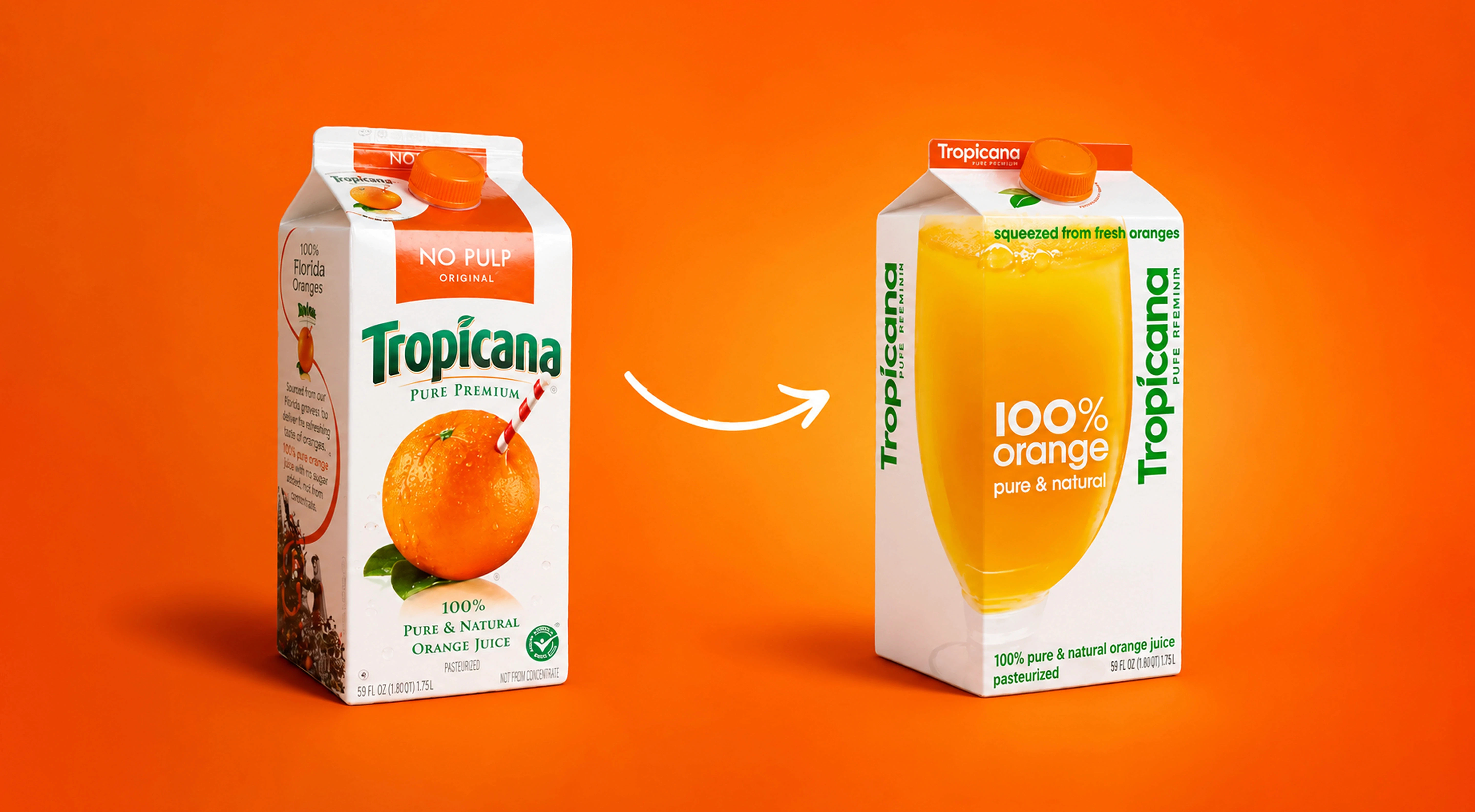
Packaging Design
Brand Identity Design
7 Reasons why good design is crucial for brand
Rebranding Mistakes That Destroy Brand Equity
June 24, 2021 | 10 min read
June 24, 2026 | 10 min read
Brand Identity Design
Brand Asset Handoff Checklist:
What to Deliver and How
June 24, 2026 | 10 min read
Ready to build a brand that works everywhere?
Ready to build a brand that works everywhere?
Ready to build a brand that works everywhere?
Get valuable strategy, culture, and brand insights straight to your inbox.
By signing up to receive emails from Abstrct Design, you agree to our Privacy Policy. We treat your info responsibly. Unsubscribe anytime.
© All rights reserved Abstrct Design - 2026
Contact Us
hello@abstrctdesign.com
To Ring
+91 98194 78752
Get valuable strategy, culture, and brand insights straight to your inbox.
By signing up to receive emails from Abstrct Design, you agree to our Privacy Policy. We treat your info responsibly. Unsubscribe anytime.
© All rights reserved Abstrct Design - 2026
Contact Us
hello@abstrctdesign.com
To Ring
+91 98194 78752
Get valuable strategy, culture, and brand insights straight to your inbox.
By signing up to receive emails from Abstrct Design, you agree to our Privacy Policy. We treat your info responsibly. Unsubscribe anytime.
© All rights reserved Abstrct Design - 2026
Contact Us
hello@abstrctdesign.com
To Ring
+91 98194 78752