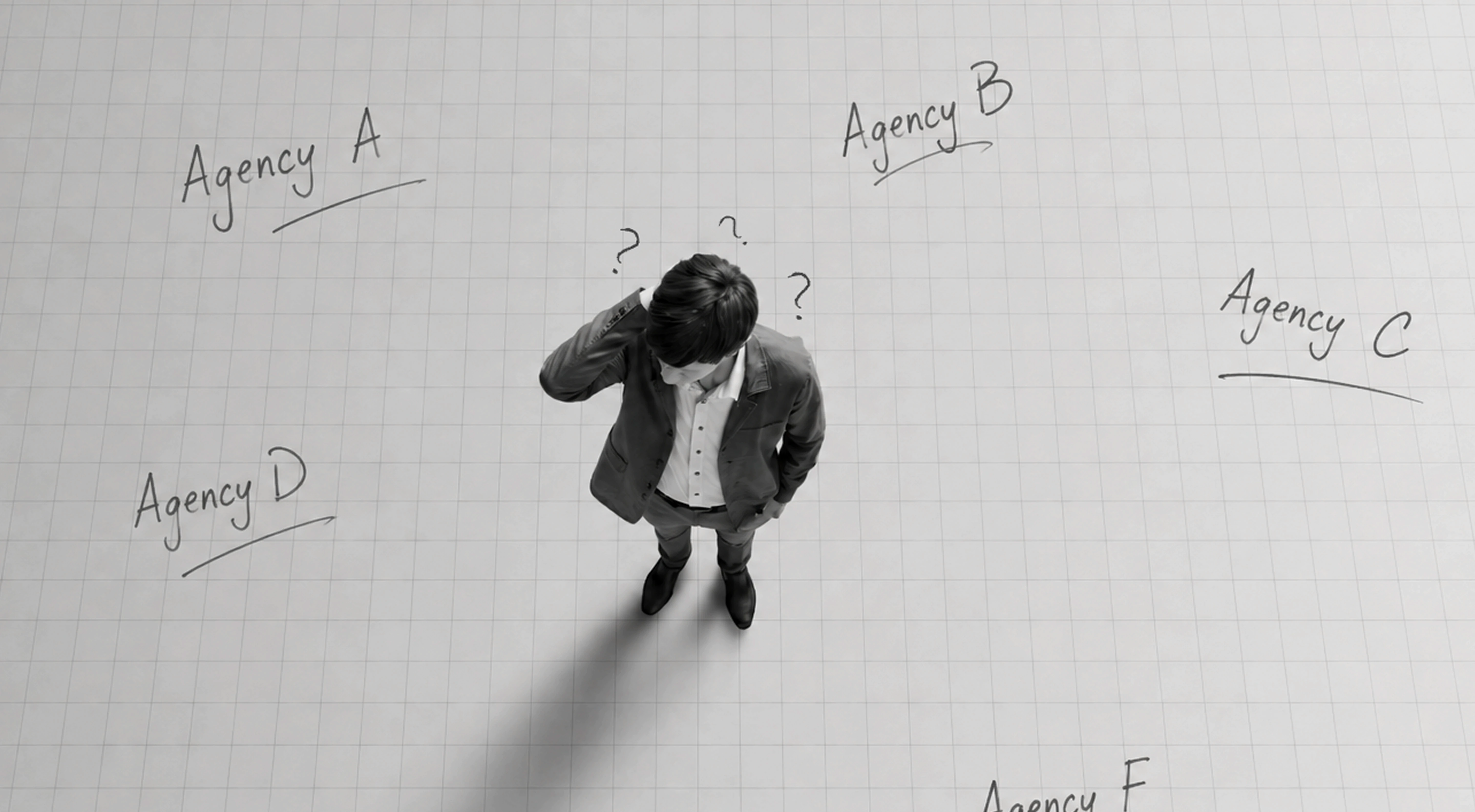
A strong business idea can still struggle to get investor attention if the pitch deck does not communicate it clearly. Some pitch deck mistakes make the business harder to understand before an investor has enough information to evaluate the opportunity properly.
Investors often review many opportunities, which means a deck needs to communicate its core story efficiently. If the first few slides are confusing, overloaded, or missing essential context, the reader has to work harder to understand what the company does, who it serves, and why the opportunity matters.
That does not mean design alone determines whether a company gets funded. Traction, market potential, team, business model, competition, and financial fundamentals remain critical. But poor communication can prevent those strengths from being understood.
Common pitch deck errors often begin with unclear hierarchy. The founder may know the business deeply, but an investor is seeing it with fresh eyes. A slide packed with information may feel comprehensive to the founder while appearing unfocused to someone reviewing the company for the first time.
Good pitch deck design creates a clear path through the business case. Each slide should communicate one primary idea and move the narrative forward.
An investor deck checklist should therefore evaluate more than whether every expected slide exists. It should ask whether the story can be understood quickly, whether important information is easy to find, and whether each slide has a clear takeaway.
Understanding how to fix a pitch deck starts with one principle: reduce the effort required to understand the opportunity without oversimplifying the business itself.
Many pitch deck mistakes happen before visual design becomes a problem. If the narrative structure is unclear, even a polished presentation can leave investors unsure about the opportunity.
Mistake #1: No Clear Problem Statement
The deck should establish what problem the business solves and who experiences it. A vague opening filled with broad market statements can make the opportunity difficult to understand.
A stronger problem statement is specific enough to establish the customer, pain point, and significance of the problem. The solution, market opportunity, and business model then have a clear foundation.
Mistake #2: Burying or Omitting the Ask
A fundraising deck should make the funding ask easy to identify. Investors should understand how much the company is raising and, where appropriate, how that capital supports the next stage of growth.
Hiding this information until the final moments—or leaving it out entirely—creates unnecessary ambiguity. The exact placement can vary by pitch context, but the ask should not be difficult to find.
Mistake #3: An Inconsistent Narrative Order
Another of the most common pitch deck errors is jumping between topics without a logical progression. A deck might move from product to team, back to market size, then suddenly to traction.
A stronger narrative creates continuity between the problem, solution, market, product, business model, traction, competition, team, financial context, and funding ask. The exact sequence can vary, but each section should prepare the reader for what comes next.
When using an investor deck checklist, review the presentation as one story rather than a collection of individual slides. That is often the first step in understanding how to fix a pitch deck.
Even when the narrative structure is strong, poor content decisions can make a pitch difficult to absorb. Some of the most common pitch deck errors happen when founders try to fit too much information into every slide.
Mistake #4: Overloading Slides With Text
A pitch deck should support the story, not turn every slide into a document. Long paragraphs, multiple messages, and excessive bullet points force investors to spend more time reading and less time understanding the central takeaway.
Whether the deck is being presented live or reviewed independently, each slide should have a clear hierarchy. Strong headlines, concise supporting copy, and focused visuals make important information easier to scan.
Mistake #5: Presenting Data Without Context
Charts and metrics are useful only when investors understand what they mean.
Showing revenue growth, retention, market size, acquisition costs, or user numbers without context leaves the investor to interpret the significance. A chart should communicate a takeaway, not simply display data.
Use a clear headline to explain why the metric matters, and provide relevant context such as the timeframe, comparison point, or source where needed.
Mistake #6: Using Too Much Jargon
Founders naturally become familiar with industry terminology, but investors may not share the same technical context. Excessive jargon, acronyms, and complicated descriptions can obscure an otherwise compelling value proposition.
Simplifying language does not mean simplifying the business. It means communicating complexity clearly.
When running an investor deck checklist, ask whether someone unfamiliar with the company can understand each slide quickly. Learning how to fix a pitch deck often begins by removing information that competes with the main message.

Visual design cannot replace a strong business case, but it affects how clearly and professionally that business case is presented. Several pitch deck mistakes come from visual inconsistency rather than the information itself.
Mistake #7: Inconsistent Fonts, Colors, and Layouts
If every slide follows a different layout, typography style, or color treatment, the presentation can feel fragmented.
A consistent design system creates continuity. Define typography, colors, margins, grids, chart styles, and recurring layouts before refining individual slides. Consistency also makes the deck easier to update as information changes.
Mistake #8: Using Low-Quality or Distorted Visuals
Pixelated logos, stretched screenshots, poorly cropped photographs, and low-resolution product images can reduce the perceived quality of an otherwise strong presentation.
Use clear, correctly proportioned assets and prioritize visuals that help explain the product or opportunity. A relevant product screenshot or diagram is often more useful than a generic decorative image.
Mistake #9: Poor Data Visualization
A chart should make information easier to understand. Too many colors, unnecessary 3D effects, tiny labels, crowded legends, or multiple competing datasets can do the opposite.
Simplify charts around the key message. Use readable labels, appropriate scales, clear units, and visual emphasis to direct attention toward the most important data point. Avoid manipulating axes or proportions in ways that could misrepresent the underlying numbers.
These common pitch deck errors are particularly important during a final investor deck checklist. Investors should be able to understand the slide hierarchy, important metrics, and overall narrative without fighting against the presentation design.
Knowing how to fix a pitch deck is therefore not about making every slide more decorative. It is about using design to make the business case clearer, faster to understand, and more credible.
Not every fundraising deck needs outside support. But there are situations where repeated founder-led edits can make the presentation harder to evaluate objectively.
One signal is consistent silence or rejection despite having a business case that appears strong on fundamentals. That does not automatically mean presentation design is responsible. Investors may decline because of market size, traction, timing, competition, investment thesis, economics, or many other factors. However, if investors repeatedly misunderstand the business or ask questions the deck should already answer, communication may be part of the problem.
Another sign is a deck that has grown messy over time.
Fundraising presentations often pass through many revisions. New traction numbers are inserted, market slides change, advisors suggest additional content, financial information evolves, and founders create new versions for different conversations. Eventually, the narrative and visual hierarchy can become inconsistent.
A professional content review can identify where the story is repetitive, unclear, or out of sequence. A presentation design review can address hierarchy, typography, layouts, charts, imagery, and consistency without changing the underlying business case.
External review is particularly useful when the team is too close to the content to recognize common pitch deck errors.
Before bringing in outside help, founders can use the investor deck checklist to identify obvious issues internally. If the story still feels difficult to simplify or the presentation no longer reflects the quality of the business, professional review may be worthwhile.
The purpose is not to make the deck look impressive for its own sake. It is to make the opportunity easier to understand, evaluate, and remember.
Why do investors reject pitch decks quickly?
What is the biggest pitch deck design mistake founders make?
One of the most common mistakes is overloading slides with text, which forces investors to read instead of listening to the founder's narrative.
Should a pitch deck include financial projections?
Yes, most investors expect at least high-level financial projections, though they should be presented clearly and simply rather than as dense spreadsheets.
How do I know if my pitch deck needs a redesign?
If you're getting consistent rejections or silence despite a strong business case, or your deck has become cluttered after many rounds of edits, it's likely time for a design review.