Watch face design trends 2026 are not simply about choosing a new visual style. They reflect broader changes in wearable technology, operating systems, display capabilities, user behavior, and the amount of information people expect to access from their wrist.
As smartwatch platforms evolve, users become familiar with new interface patterns through native watch faces and system experiences. Better complications, richer widgets, contextual information, improved always-on displays, and more sophisticated visual effects can gradually change what users consider a modern wearable interface.
This creates an important challenge for brands developing their own wearable products.
A watch face that looked contemporary several years ago may begin to feel dated when placed beside newer OS-native interfaces. However, responding to smartwatch UI trends does not mean copying every platform update or redesigning the interface whenever a new visual effect becomes popular.
Instead, brands should understand what each trend represents.
Data-dense layouts, for example, reflect demand for more useful information at a glance. Minimalist watch face design responds to a different need: clarity, restraint, and efficient always-on experiences. Adaptive interfaces point toward more contextual and personalized wearable experiences.
The strongest wearable interface design 2026 strategies separate temporary aesthetics from longer-term changes in user expectations.
Before adopting a trend, ask whether it improves glanceability, supports the product’s use case, fits the brand, and works within hardware constraints.
Watch face design trends 2026 should therefore be treated as signals rather than instructions. The goal is not to make a wearable look trendy. It is to understand how interface expectations are changing and decide which changes genuinely improve the product.
One of the most visible interface shifts influencing watch face design trends 2026 is the move toward translucent surfaces, layered depth, blur, and glass-like interface treatments.
Apple introduced Liquid Glass in 2025 as a broader design language across its platforms, including watchOS. The system uses translucent interface materials that can reflect and refract surrounding content while creating greater visual depth.
For wearable brands, the significance is not simply the glass effect itself. It demonstrates a broader move away from completely flat interfaces toward UI that uses layering and depth to establish hierarchy.
That creates new considerations for brand systems.
A brand color viewed through a translucent layer may not appear identical across different backgrounds. Logos, typography, icons, and complications therefore need sufficient contrast rather than depending on one fixed background treatment. Designers should test these elements across realistic watch states instead of evaluating a single polished mockup.
There are also technical constraints. Blur, transparency, animation, reflections, and continuously changing visual effects can introduce rendering demands. Their actual performance and battery impact depends on the device, operating system, display technology, and implementation.
This means wearable interface design 2026 should use depth deliberately rather than applying glass effects to every element.
For some brands, subtle translucent complications or layered controls may create useful hierarchy. For others, minimalist watch face design may remain more appropriate.
Among current smartwatch UI trends, Liquid Glass is valuable because it highlights how depth can communicate structure. The design opportunity is not to imitate a platform aesthetic, but to understand whether translucency and layering can strengthen hierarchy while preserving legibility, brand recognition, and performance.
Another major direction within watch face design trends 2026 is the growing use of complications and widgets to turn the watch face into an at-a-glance dashboard.
Users increasingly expect wearables to show more than time. Health metrics, activity progress, weather, calendar events, battery status, timers, notifications, and smart-home information can all compete for limited screen space. For products built around fitness, health, productivity, or connected devices, this information density can provide genuine value.
The design challenge is deciding what deserves attention first.
As smartwatch UI trends become more data-focused, information hierarchy becomes more important than decoration. Primary information should remain immediately recognizable, while secondary complications need enough visual separation to prevent the interface from becoming crowded.
A useful approach is to establish levels of priority. Time or the product’s primary metric can occupy the strongest visual position, while secondary information uses smaller typography, simplified icons, or dedicated complication areas.
Screen size makes restraint essential. Adding more widgets does not automatically create a more capable experience. If users need several seconds to identify a metric, the watch face has lost much of its glanceable advantage.
This is particularly important for wearable interface design 2026, where increasingly capable devices can tempt teams to expose every available feature simultaneously.
Brands should test data-heavy layouts on the actual display, under realistic viewing conditions, rather than judging them only on enlarged design files.
Among watch face design trends 2026, data density is valuable when it reduces interaction. The goal should be to surface the right information at the right priority—not to fill every available pixel.

While some smartwatch UI trends are moving toward greater information density, another direction is doing almost the opposite. Minimalist and monochrome watch faces reduce visual elements to create interfaces that feel quieter, faster to scan, and more focused.
A minimalist watch face design may use a restrained color palette, simplified typography, limited complications, and carefully controlled spacing. Monochrome approaches can reduce the interface further by relying primarily on one color family, tonal differences, or high-contrast elements.
This direction is particularly relevant to always-on display experiences.
Wearable platforms may simplify graphics, reduce brightness, limit animation, or alter refresh behavior in lower-power states. On some display technologies and implementations, darker or simplified visuals may also contribute to power-management strategies. However, battery benefits should not be assumed universally; they depend on the screen technology, operating system, hardware, and rendering behavior.
For brands, minimalism creates a different challenge: every detail becomes more visible.
When decorative elements are removed, typography, iconography, spacing, alignment, and proportions carry more of the identity. A generic typeface or inconsistent icon set becomes much harder to hide.
This means minimalist watch face design is not necessarily easier to create. It often requires greater precision.
Within watch face design trends 2026, minimalism also provides an alternative to increasingly complex wearable dashboards. Some users may want rich information during a workout but a quieter face during everyday use.
For wearable interface design 2026, this suggests that brands should consider multiple states or face variations rather than forcing one layout to handle every context. A restrained visual system can still feel distinctive when its typography, icons, spacing, and brand details are carefully designed.
One of the more forward-looking watch face design trends 2026 is the movement toward interfaces that adapt to context instead of remaining completely static.
A context-aware watch face can change the information it prioritizes based on signals such as time of day, activity, calendar context, or other device-supported inputs. A morning state might emphasize weather and upcoming events, while a workout state could prioritize heart rate, duration, or activity metrics.
AI can potentially extend this idea by helping systems determine which information is most relevant to an individual user. However, the exact capabilities depend heavily on the wearable platform, permissions, available sensors, privacy requirements, and software implementation.
For brands, the important design shift is from creating one fixed face to developing a modular system.
Instead of positioning every complication permanently, designers can define adaptable zones, component priorities, typography rules, icon behavior, and different states. This allows information to change while the overall interface continues to feel like the same branded product.
That consistency is essential. Excessive automatic changes can make a watch face unpredictable, particularly if users cannot understand why information has moved or disappeared.
Wearable interface design 2026 therefore needs to balance personalization with familiarity and user control.
Among current smartwatch UI trends, context-aware design has the potential to make limited screen space more useful because the interface does not need to display everything simultaneously.
The opportunity for brands is not simply to add “AI” to a watch face. It is to create a flexible design system capable of presenting relevant information in different contexts while maintaining clear hierarchy, recognizable brand elements, and a predictable user experience.
Watch face design trends 2026 should inform a product roadmap, not control it. The challenge for wearable brands is deciding which changes solve a real user or product need and which are better monitored before investing development resources.
Start by separating trends into three categories: adopt, test, and watch.
Adopt trends that already align with clear user needs. If customers rely heavily on health, calendar, or activity information, better complication hierarchy may deserve immediate attention. If glanceability is a problem, minimalist watch face design could provide more value than adding visual effects.
Test trends that offer potential but introduce design or technical uncertainty. Translucent, depth-driven interfaces are a good example. Prototype them with the actual brand colors, complications, display size, and always-on states before committing them to the product.
Watch emerging capabilities such as AI-personalized interfaces when platform support, user value, or technical requirements are still evolving.
Future-proofing is equally important for wearable interface design 2026.
Instead of creating one rigid watch face, develop a modular system with reusable typography styles, iconography, complication zones, color rules, states, and layout principles. This makes it easier to adapt when operating systems introduce new capabilities or when the product gains additional features.
Brands should also avoid tying their entire identity to one temporary visual trend. Liquid Glass, data-dense dashboards, and other smartwatch UI trends can influence execution without defining the whole product.
A future-ready watch face system maintains recognizable brand foundations while allowing individual interface elements to evolve as user expectations, hardware, and platforms change.
At Abstrct, trend-aware watch face design starts with the product rather than the trend itself.
A wearable interface needs to work within a particularly constrained environment. Screen space is limited, interactions are brief, hardware capabilities vary, and information often needs to be understood within seconds. That means adopting watch face design trends 2026 only makes sense when they improve the experience or strengthen the product’s positioning.
Our approach considers brand identity, information hierarchy, typography, iconography, complications, screen dimensions, and technical constraints together.
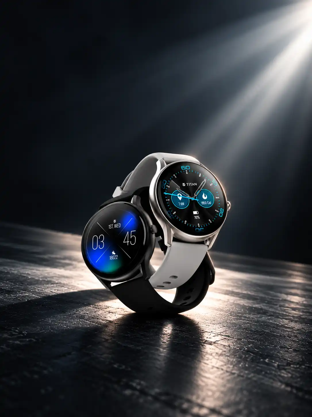
The Titan project is a useful example of how Abstrct approaches wearable design as a broader visual system rather than treating the watch face as an isolated screen. For an established watch brand, new interface directions need to feel contemporary while remaining appropriate to the product and its wider brand language.
The same thinking applies to current smartwatch UI trends.
Liquid Glass-inspired depth may be useful where layering improves hierarchy. Data-dense layouts may work for information-heavy use cases. Minimalist watch face design can create stronger focus when fewer elements are needed. Context-aware systems may require modular components that can adapt without losing consistency.
The goal is not to place every trend into one interface. It is to identify which direction supports the user, brand, and hardware.
As wearable interface design 2026 continues to evolve, brands need systems flexible enough to respond without redesigning from scratch every time platforms change.
If your existing wearable interface needs to evolve for current expectations, talk to Abstrct about a 2026 watch face and wearable UI refresh.
What are the biggest watch face design trends in 2026?
What is liquid glass design in watch faces?
It refers to a translucent, layered visual style with blur and depth effects, inspired by broader platform design language shifts.
Are data-dense watch faces better for users?
Not always — more data can improve utility but also risks reducing legibility if information hierarchy isn't carefully designed.
Do watch face design trends affect battery life?
Yes, visual effects like translucency and animation can increase power draw, so trend adoption should be balanced against always-on display constraints.
How often should a brand update its watch face designs?
Many brands refresh watch faces seasonally or alongside major OS updates to stay aligned with current interface trends.