The bi-fold vs tri-fold brochure decision starts with understanding how each format divides information. Both are common brochure fold types, but their panel structures create very different opportunities for content, imagery, and reading flow.
A bi-fold brochure uses one fold to divide a sheet into two sections, creating four panels in total: a front cover, two interior panels, and a back cover. Because there are fewer panels, each section typically has more usable visual space. This makes bi-fold brochures suitable for larger photography, bold headlines, product showcases, and messages that do not require many separate content sections.
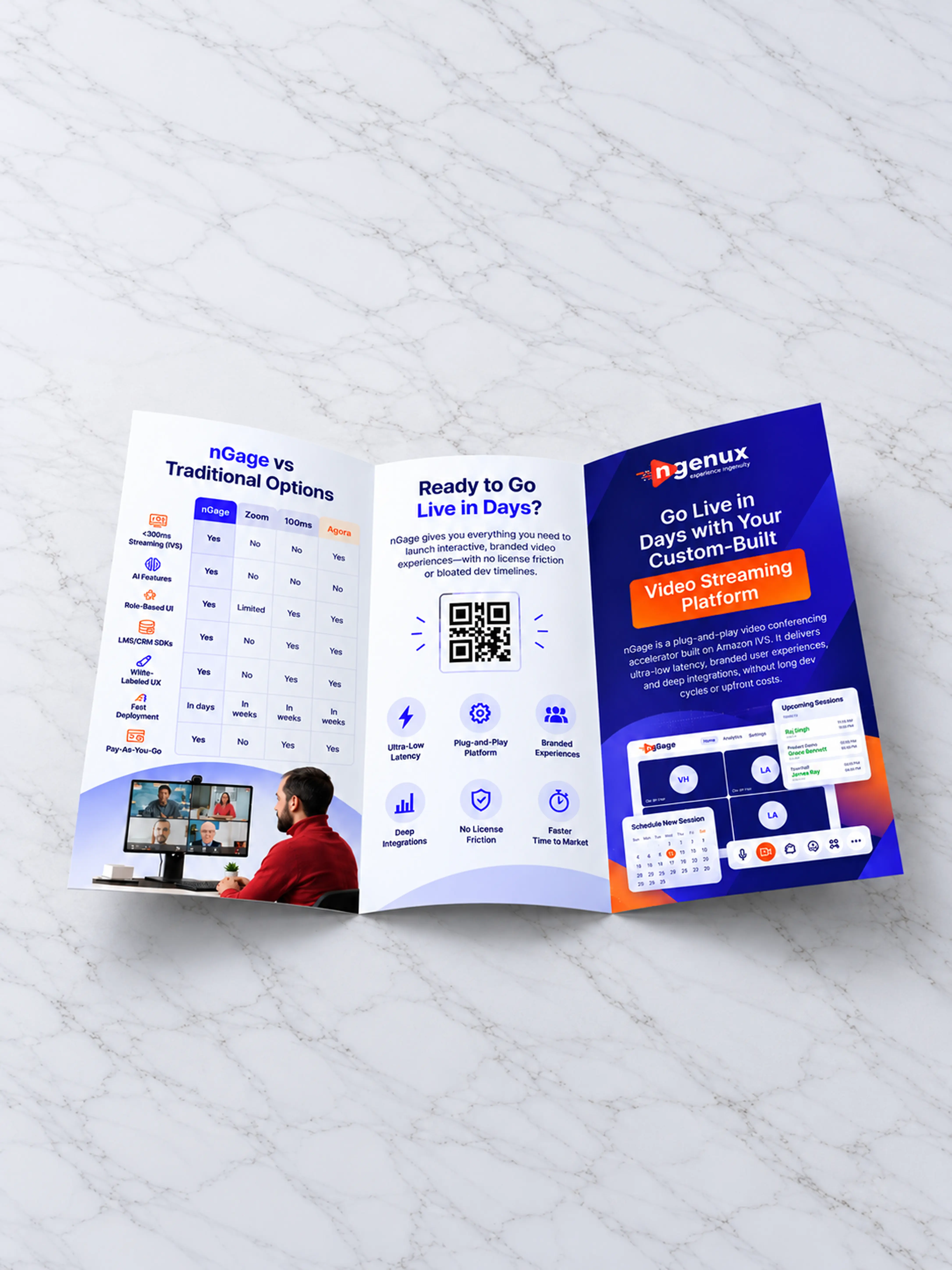
A tri-fold brochure uses two folds to create six panels: three on one side and three on the other. The panels are narrower, but the additional sections make it easier to organize information into smaller topics or sequential steps.
A typical tri-fold brochure design might use the cover to introduce the message, followed by separate panels for the problem, solution, services, benefits, contact information, or call to action.
The basic layout difference can be understood as:
Bi-fold: 4 larger panels → better for spacious layouts and focused messages.
Tri-fold: 6 narrower panels → better for segmented information and structured reading sequences.
However, actual panel dimensions may not always be identical. Some folding methods require one panel to be slightly narrower so it folds correctly inside another. Final dimensions should therefore follow the printer’s production specifications.
A useful brochure format guide should consider not only how much content you have, but also how readers should experience that content as they unfold the brochure.
A bi-fold brochure works particularly well when the message is focused and does not need to be divided into many separate sections.
Because the format provides four relatively large panels, designers have more space for strong imagery, typography, product photography, illustrations, and larger blocks of important information. This can create a more spacious and premium visual experience.
Consider a real estate brochure focused on one property. The cover can establish the property and positioning, while the interior spread can feature large photographs, key specifications, amenities, and selling points. The back panel can then contain contact details and the next step.
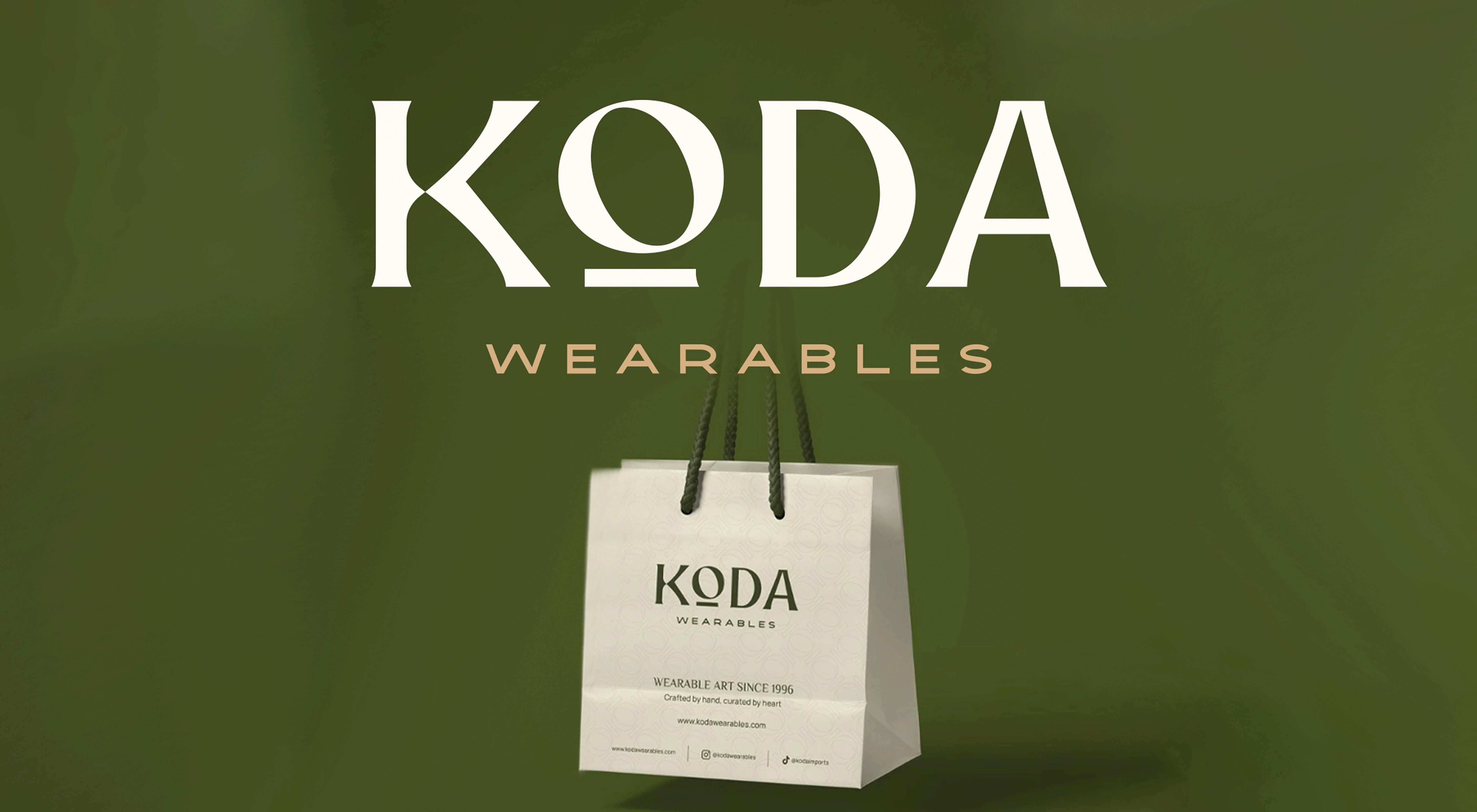
Luxury retail can benefit from the same structure. Instead of dividing products across numerous narrow sections, a bi-fold layout can give photography more room and allow the visual identity to create the desired impression.
When comparing a bi-fold vs tri-fold brochure, bi-fold is often stronger when:
One product or service is the main focus
The message has relatively few sections
Photography or illustration needs significant space
A spacious, editorial layout is preferred
Readers need to understand the main message quickly
This format can also work well for company introductions, premium product launches, property marketing, hospitality material, and visually led sales collateral.
However, fewer panels mean the content hierarchy needs to be disciplined. Trying to place six or seven distinct topics into four panels can quickly make the brochure feel crowded.
Among common brochure fold types, bi-fold works best when simplicity is intentional. It gives each message more visual breathing room instead of forcing a large amount of information into a smaller structure.
A tri-fold brochure design becomes useful when the message naturally divides into several distinct sections or needs to guide readers through information in a sequence.
With six panels available, brands can create clearer separation between topics. A brochure might introduce the organization on the cover, explain a customer problem, present services, outline a process, communicate benefits, and finish with contact information or a call to action.
This structure makes tri-fold brochures particularly useful for content-heavy communication.
Healthcare organizations, for example, may need to explain a service, eligibility, preparation instructions, benefits, next steps, and contact information. Separating these topics into individual panels can make the material easier to scan than presenting everything across a large continuous spread.
B2B service companies can use the same approach for service menus, process explanations, packages, or different capabilities. Event brochures can organize schedules, venue details, speakers, instructions, and contact information into clearly defined sections.
In a bi-fold vs tri-fold brochure comparison, tri-fold is often suitable when:
The message contains several distinct topics
Information needs to follow a sequence
Readers are likely to scan for specific sections
Multiple services or categories need explanation
The brochure needs to contain substantial information in a compact format
The additional panels should not become an excuse to add unnecessary copy. Narrower panels can feel crowded quickly if typography, spacing, and information hierarchy are not carefully managed.
Fold direction also influences reading order. Designers need to understand which panel the reader sees first, what appears after the initial opening, and how the remaining information is revealed.
A strong brochure format guide therefore treats tri-fold brochure design as a sequence of connected content moments rather than six independent boxes.

The bi-fold vs tri-fold brochure decision becomes clearer when the format is matched to how customers consume information within a particular industry. Retail, healthcare, and B2B services often have different content requirements, so the same brochure structure will not work equally well for all three.
In retail, bi-fold brochures work well for visually driven communication. A product launch, premium collection, seasonal lookbook, or single-category promotion can benefit from larger panels that give photography and product imagery more space. When several product categories, offers, store services, or promotional messages need to be presented together, a tri-fold brochure design can provide better organization.
Healthcare communication usually contains more structured information. A patient brochure may need separate sections for symptoms, treatment options, preparation instructions, benefits, precautions, appointment information, and contact details. Among common brochure fold types, tri-fold formats can work well here because information can be divided into clearly identifiable sections that readers can scan.
B2B service brochures often face a similar challenge. Companies may need to introduce several capabilities, explain their process, highlight differentiators, and provide a clear next step. A tri-fold can organize these topics into a logical sequence. A bi-fold may be more appropriate when the brochure focuses on one specific service, solution, or case study.
A practical brochure format guide therefore considers the communication requirement rather than choosing a fold based only on industry convention.
Retail may benefit from either format depending on the number of products. Healthcare often benefits from structured sections. B2B services may use tri-folds for multiple capabilities and bi-folds for focused sales messages.
The best format is ultimately the one that makes the information easiest for the intended audience to understand and act on.
Good brochure design begins before typography, colors, or imagery are selected. For both bi-fold and tri-fold formats, the first step should be deciding what information belongs on each panel and in what order the reader will encounter it.
For a bi-fold brochure, the larger interior spread can support a strong visual hierarchy. The cover establishes the main message, the interior can communicate the core information, and the back panel can provide supporting details or a call to action.
The challenge is avoiding an interior spread that feels like one large block of information. Even with fewer panels, content should still be divided into clear sections using headlines, imagery, spacing, and hierarchy.
Tri-fold brochure design requires even more careful panel planning.
Because each panel is narrower, long paragraphs, oversized images, or wide charts may not fit comfortably. Content should be divided according to the unfolding sequence so that important ideas are not interrupted by folds or placed in unexpected positions.
The cover is particularly important across both brochure fold types. It should quickly communicate what the brochure is about and give readers a reason to open it. A strong headline, relevant visual, recognizable branding, and clear value proposition are generally more useful than trying to summarize the entire brochure on the cover.
Fold direction also affects the experience. Depending on the folding method, different panels become visible at different stages. This changes where introductions, supporting information, and calls to action should appear.
Designers should therefore create a physical mockup before final production. Even a simple paper prototype can reveal incorrect reading sequences or awkward content breaks.
Final artwork should also follow the printer’s specifications for panel dimensions, folds, bleed, safe areas, and production setup rather than assuming every bi-fold or tri-fold template uses identical measurements.
There is no universal winner in the bi-fold vs tri-fold brochure comparison. A brochure converts better when its format matches the amount of information, the audience’s reading behavior, and the context in which it is distributed.
A bi-fold brochure can perform better when the message is simple and visually driven. Larger panels give photography, headlines, product benefits, and calls to action more room to breathe. For a premium product, single service, property, or focused campaign, this simplicity can help readers understand the message without processing unnecessary information.
A tri-fold brochure design can work better when readers need more information before taking action. Six panels make it easier to separate services, benefits, processes, FAQs, or next steps into smaller sections. This can be particularly useful for healthcare, B2B services, events, and other information-heavy communication.
Distribution context matters as well.
A brochure placed in a display rack needs a front panel that communicates quickly within the visible area. A brochure handed to someone during a sales conversation can support a more guided reading experience. Direct-mail pieces may have different size, folding, and mailing requirements.
When comparing brochure fold types, ask:
Is the message focused or information-heavy?
How many distinct sections are required?
Does photography need significant space?
Will readers scan or read sequentially?
Is the brochure mailed, handed out, or displayed?
What information should readers see first?
Where should the primary call to action appear?
Does the final folded size suit the distribution method?
Conversion depends less on the number of folds and more on how effectively the brochure moves readers from attention to understanding to action.
A useful brochure format guide should begin with content planning rather than choosing a fold first and forcing the information into it later.
Start by listing everything the brochure needs to communicate. Group related information into sections and identify the primary message. If the content naturally forms three or four larger sections and relies heavily on photography, a bi-fold may provide the stronger structure.
If the content includes several services, process stages, categories, or informational topics, a tri-fold brochure design may make the material easier to organize and scan.
Next, consider how the brochure will actually be used.
A sales representative may need a brochure that supports a conversation. A patient may need to find specific information quickly. A retail customer may respond more strongly to imagery and product presentation. Someone picking up a brochure from a display rack may initially see only part of the cover.
The physical format should support these behaviors.
Design should then establish a clear path through the content. The cover creates interest, internal panels build understanding, and the final sections should make the next action obvious. Contact information, QR codes, website details, booking instructions, or another relevant call to action should be easy to locate.
The bi-fold vs tri-fold brochure decision is therefore not simply a question of which format looks better. It is a communication decision involving content hierarchy, audience behavior, visual requirements, distribution, and production.
If you are unsure which brochure fold type best suits your content, Abstrct’s brochure design team can help recommend the right format and build the information structure, visual hierarchy, and final print-ready design around it.