Logo design trends 2026 can be useful for understanding how visual culture, technology, and digital platforms are changing. They can reveal new approaches to typography, motion, simplicity, adaptability, and visual personality.
But a trend should influence execution, not replace strategy.
A logo is usually expected to last much longer than a social media aesthetic or seasonal campaign. Adobe’s current 2026 logo coverage makes a similar distinction: brands can use contemporary ideas while still prioritizing versatility, recognizability, and longevity rather than constantly redesigning themselves to follow what is popular.
This is where the timelessness vs trend-chasing principle from our complete logo design guide becomes important.
Before adopting a trend, ask whether it strengthens something already true about the brand. Does expressive typography support its personality? Does motion make sense because most customer interactions happen digitally? Does a stripped-back logo improve usability across smaller screens?
There is also a difference between trends used in the core brand mark and trends applied to the broader identity.
A logo may need a relatively durable structure, while campaign graphics, motion treatments, textures, colors, or seasonal variations can be more experimental. This allows a brand to feel contemporary without rebuilding its primary recognition asset every few years.
The best logo design inspiration should therefore be treated as a source of possibilities, not a checklist.
Here are four of the strongest directions shaping modern logo design styles in 2026.
A logo is no longer designed for one fixed application.
Today, the same identity may need to appear on a desktop website, mobile interface, app icon, social avatar, digital advertisement, presentation, product, packaging, signage, and video. This is making adaptive logo systems increasingly relevant.
Instead of forcing one logo configuration into every space, responsive systems use related versions for different contexts. A full combination mark might appear on a website, while a compact symbol works as an app icon. A detailed version might be reserved for large formats while a simplified version handles small screens.
The important point is consistency. Responsive does not mean creating unrelated logos for every platform. Core recognition cues—such as shape, typography, proportion, or symbol—should remain identifiable.
Adobe’s 2026 coverage points to digital adaptability as an important reason brands continue simplifying logo systems.
This trend is particularly useful for digital-first brands, SaaS businesses, apps, consumer products, media brands, and companies operating across many channels.
Durability risk: Low.
Responsive design solves a functional problem rather than depending purely on an aesthetic trend. The bigger risk is creating too many variations and weakening consistency.
Minimalism remains prominent among logo trends, but the direction in 2026 is not simply about removing everything possible.
The stronger approach is purposeful reduction.
Logos are becoming cleaner and easier to reproduce while retaining a recognizable detail: an unusual proportion, distinctive letterform, bold shape, clever negative space, or memorable typographic feature.
Adobe describes a continuing “minimalist evolution” driven partly by screen-first applications, while also noting room for distinctive details and texture. Its recent designer research found ongoing simplification intended to improve digital adaptability, while warning that excessive reduction can remove personality.
Canva’s broader 2026 trend research similarly identifies a move toward structured simplicity, paired-back palettes, straightforward logos, and reduced visual noise.
This makes bold minimalism suitable for technology, finance, professional services, D2C, fashion, and other brands that need to work cleanly across digital and physical environments.
But minimal should not become generic.
Removing every distinctive feature can leave a brand with the same geometric sans-serif wordmark or abstract symbol as dozens of competitors.
Durability risk: Low to medium.
Simple structures tend to age well, but trend-driven “debranding” can reduce differentiation if every brand follows the same visual formula.
Typography is becoming a stronger source of personality in logo design trends 2026.
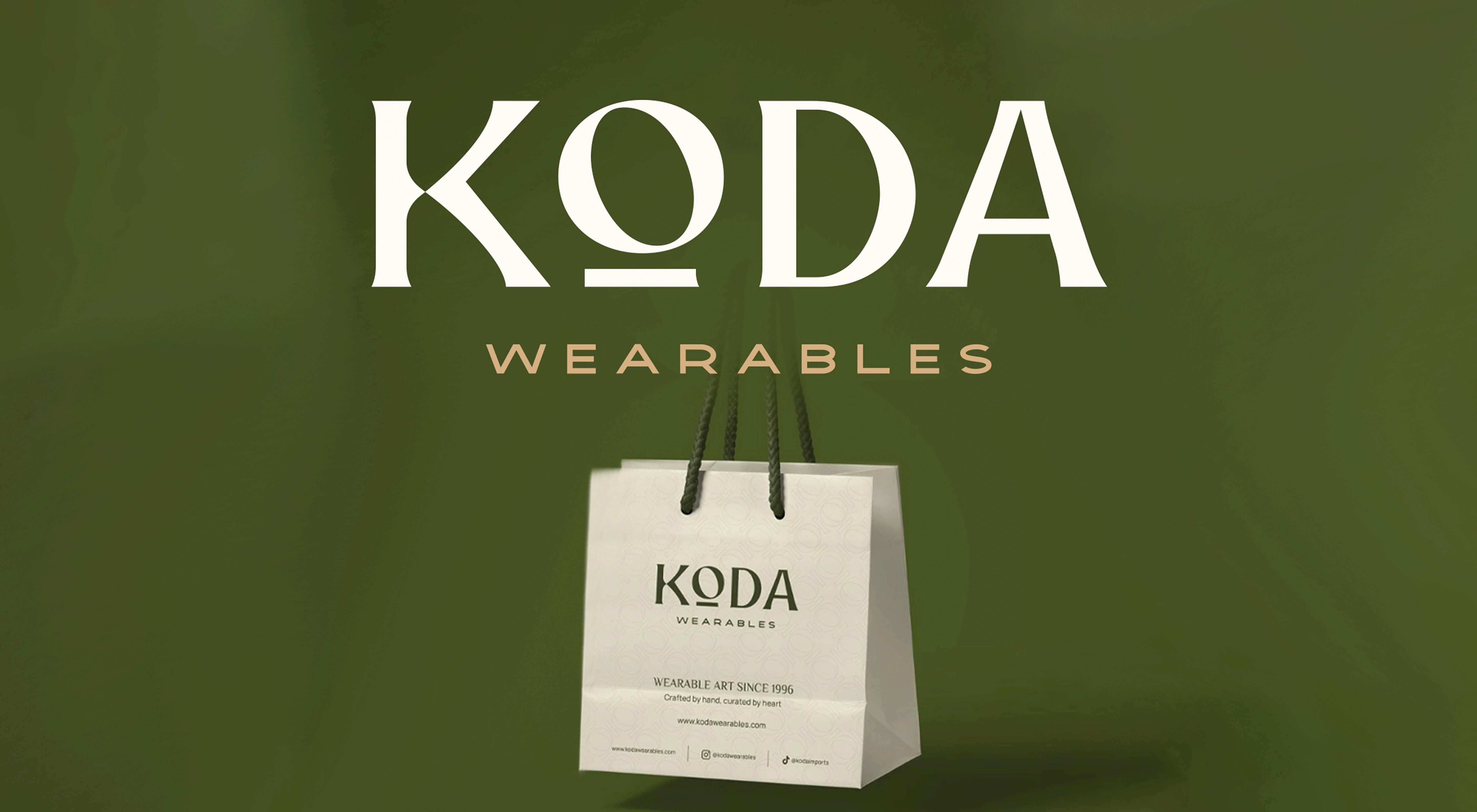
Instead of relying on a generic typeface with minimal modification, brands are exploring custom letterforms, unusual proportions, variable type, distinctive serifs, unexpected character details, and typography that can become recognizable without needing a separate symbol.
Adobe identifies typography as an important area of experimentation for 2026, including variable fonts that can adapt across media and screen sizes.
At the same time, broader visual trends are moving away from the idea that everything needs to feel perfectly polished. Canva’s 2026 research highlights growing interest in bold typography, human imperfection, raw visual language, and simpler but more characterful branding.
This creates an opportunity for brands whose names themselves can become the primary recognition device.
Expressive typography can work especially well for fashion, beauty, hospitality, food and beverage, entertainment, cultural organizations, creative businesses, and consumer brands where personality matters.
The challenge is balancing character with legibility.
If every letter is highly experimental, the audience may struggle to read or remember the name. The strongest custom wordmarks usually concentrate distinctiveness in a few controlled details rather than making every character compete for attention.
Durability risk: Medium.
A genuinely custom typographic idea can remain recognizable for years. A wordmark built around an extremely fashionable type treatment may date much faster.
As brands increasingly appear in digital environments, logo design is expanding beyond static artwork.
Motion-ready logos are designed with animation in mind from the beginning. A symbol might assemble, rotate, transform, expand, respond to interaction, or transition between different configurations.
Adobe identifies kinetic or animated logos as a notable 2026 direction, particularly for digital environments and micro-interactions. It recommends maintaining a recognizable visual anchor even when the mark changes or moves.
This distinction is important.
A successful animated logo is not simply a static logo with an effect added afterward. The motion can express something about the brand itself. A modular technology brand might assemble from components. An entertainment identity might transform dramatically. A digital product might use a subtle movement during loading or interaction.
Motion-ready systems are particularly relevant for technology, media, entertainment, gaming, sports, streaming, digital products, and brands producing significant amounts of video content.
However, the static logo must still work.
Printed packaging, documents, merchandise, signage, favicons, and many other applications cannot depend on animation. Motion should extend a recognizable core identity rather than compensate for a weak static mark.
Durability risk: Medium.
Motion as a branding capability is likely to remain useful, but specific animation styles can date quickly. A strong underlying logo with a flexible motion system is more durable than a logo built around one fashionable animation effect.
After years of highly polished geometric branding and bright digital gradients, one direction within logo design trends 2026 is a return to softer, more natural visual language.
This can include irregular curves, flowing shapes, hand-drawn forms, muted greens, terracotta, sand tones, deep blues, and other palettes influenced by natural materials and environments. Adobe’s 2026 logo trend coverage specifically identifies nature-inspired organic forms and earthy or muted color palettes as current directions.
This approach can work particularly well for wellness, food and beverage, hospitality, beauty, sustainable products, agriculture, outdoor brands, and businesses where warmth or naturalness is genuinely connected to the positioning.
However, organic does not automatically mean sustainable.
Adding a leaf, green color, or earthy palette does not prove environmental responsibility. Sustainability claims should be supported by the company’s actual practices rather than communicated through visual cues alone.
There is also a distinctiveness problem. Leaves, trees, water droplets, mountains, and circular nature symbols are already common across environmentally positioned brands.
A stronger approach may use nature as inspiration for shape, movement, color, or texture without relying on the most obvious symbols.
Durability risk: Low to medium.
Natural forms can age well when connected to the brand’s genuine personality. Highly specific color trends are easier to refresh later without rebuilding the core logo.
One of the more visually expressive modern logo design styles combines nostalgia with ideas of the future.
Retro-futurism borrows from earlier visions of technology and progress: space-age geometry, science-fiction lettering, chrome-like treatments, vintage computer graphics, Art Deco influences, and visual references associated with previous decades.
Adobe identifies retro-futurism as a 2026 logo direction, particularly within technology, gaming, entertainment, and creative industries.
The appeal comes from contrast.
Instead of creating a completely sterile futuristic identity, brands can combine familiar historical references with contemporary execution. The result can feel nostalgic and forward-looking at the same time.
Retro-futurism can work particularly well for entertainment, gaming, music, fashion, technology products, creative businesses, and brands with a deliberately experimental personality.
But this is also one of the logo trends that requires restraint.
Chrome effects, extreme display typography, neon treatments, or references to a very specific decade can quickly dominate the identity. They may also create technical problems when the logo needs to work in one color or at very small sizes.
A better approach is often to build the retro-futurist influence into one recognizable feature—perhaps the typography, geometry, or proportions—rather than making every component stylistically nostalgic.
Durability risk: Medium to high.
Retro-futurism can produce memorable logo design inspiration, but highly aesthetic executions are more vulnerable to changing taste.

Simple geometric symbols and controlled line-based marks continue to remain relevant because they suit many of the environments where logos now appear.
Circles, grids, modular shapes, continuous lines, simplified monograms, and abstract geometry can produce marks that are compact and relatively easy to reproduce.
This direction overlaps with the broader movement toward simplified, screen-friendly branding. Adobe’s recent research found designers continuing to simplify logos for digital adaptability, while also warning that excessive simplification can remove personality.
That warning is especially relevant here.
Geometry itself is not distinctive. A circle, hexagon, abstract letter, or monoline icon becomes useful only when its construction creates a recognizable relationship with the brand.
This trend can suit technology, architecture, finance, consulting, SaaS, engineering, professional services, and brands seeking a structured visual personality.
The practical advantages are strong. Well-designed geometric marks can scale effectively, translate into one color, animate easily, and work across physical and digital applications.
The challenge is avoiding the “generic startup logo” effect.
Before choosing this direction, competitor research becomes essential. If several businesses in the same category already use similar abstract geometry, another minimal symbol may reduce rather than improve differentiation.
Durability risk: Low when distinctive; medium when generic.
The structure itself can be timeless. The greater risk is creating something so simplified that audiences struggle to distinguish it from competitors.
One of the broader shifts influencing logo design trends 2026 is the return of visible human character.
Instead of making every edge perfectly smooth and every element digitally precise, some brands are embracing hand-drawn lines, uneven shapes, grain, tactile surfaces, irregular lettering, print-inspired imperfections, and other signs of human intervention.
Canva describes 2026 as the year of “Imperfect by Design,” identifying increased interest in raw, tactile, DIY, analog-inspired, and intentionally less-polished visual language. Its trend data also points to growing interest in texture and scrapbook-style elements. Adobe similarly identifies “tactile digitalism” and intentional imperfection as notable directions in current design.
This trend can work particularly well for food, craft, hospitality, fashion, culture, lifestyle, independent retail, and creative brands that want to feel personal rather than highly corporate.
However, texture should not carry the entire logo.
A rough print effect may disappear at small sizes or reproduce inconsistently across embroidery, signage, packaging, and digital interfaces. The underlying mark should ideally remain recognizable without the texture.
One practical solution is to maintain a clean core logo while allowing handcrafted treatments to appear within the wider visual identity.
Durability risk: Medium.
Human imperfection can create lasting personality, but specific scrapbook, grain, or analog effects may become strongly associated with a particular design period.
AI-assisted design is influencing logo development in 2026, but it is better understood as a workflow trend than a logo style.
Generative tools can help designers rapidly explore visual territories, references, compositions, shapes, typography ideas, materials, and unexpected combinations during early concept development. Canva’s 2026 research describes AI as increasingly embedded in creative workflows while simultaneously identifying a stronger appetite for work that feels intentionally human.
That combination is important.
Generating dozens of visual options does not replace the strategic decisions required for professional logo design.
A designer still needs to determine whether an idea fits the positioning, differs sufficiently from competitors, works at small sizes, translates into vector form, remains effective without visual effects, and can become part of a coherent identity system.
There are also originality, intellectual-property, licensing, confidentiality, and tool-specific usage considerations when generative AI is incorporated into commercial identity development. These should be evaluated based on the particular tool and project rather than assumed to be identical across platforms.
The strongest use of AI is therefore not necessarily “generate the final logo.”
It can be used as one exploration tool before human designers select, reconstruct, refine, test, and systemize an appropriate direction.
Durability risk: Not directly applicable.
AI is changing how concepts can be explored. It should not determine whether the final identity itself looks timeless or trendy.
Nature-inspired identity is also developing beyond the familiar leaf-and-tree approach.
Brands can draw from landscapes, local architecture, regional patterns, materials, cultural forms, geography, flora, or other elements connected to where they come from and what they represent.
Adobe’s 2026 logo coverage identifies nature-inspired design as a current direction, while broader 2026 research from Canva shows renewed interest in culturally rooted aesthetics and regional visual language alongside the wider shift toward more human and less generic design.
This can provide a useful answer to one of the biggest challenges in contemporary logo design: distinctiveness.
Instead of selecting the same category icon used by competitors, a brand can search its own story for visual material.
A hospitality brand might draw from its location. A food brand might reference regional craft or ingredients. A heritage company might reinterpret an existing cultural motif through a contemporary visual system.
This direction is particularly relevant for tourism, hospitality, food, craft, cultural organizations, regional businesses, sustainability-focused brands, and companies where origin is an important part of the story.
Cultural references require careful research, however. Symbols should not be borrowed superficially simply because they look visually interesting. Their meaning, ownership, context, and appropriateness should be understood before they become part of a commercial identity.
Durability risk: Low when authentic.
Unlike a purely aesthetic trend, meaningful connections to origin, place, or brand history can provide a long-term foundation for recognition.
The best logo design trends 2026 are not necessarily the most visually exciting ones. They are the ones that reinforce what the brand already needs to communicate.
Start with brand personality.
A playful children’s brand may have room for expressive typography, handcrafted forms, bright visual experimentation, and animated identity elements. A fintech company handling sensitive financial information may prioritize clarity, confidence, simplicity, and controlled motion instead.
Neither approach is inherently better. The visual direction needs to match the expectations surrounding the brand.
Industry norms matter for the same reason. Looking at competitors helps identify what audiences already recognize within a category, but the goal should not be to reproduce those conventions. Competitor research can reveal where there is room to differentiate without making the identity feel inappropriate for the market.
Next, consider where the logo will actually appear.
A digital-first company may benefit significantly from responsive and motion-ready logo systems. A hospitality or consumer brand might have more opportunities to use tactile treatments, expressive typography, or place-inspired symbolism across packaging, signage, and physical environments.
Any trend-forward concept should then be tested against the fundamentals from our complete logo design guide.
Does it remain recognizable when reduced to favicon size? Can it work in one color? Is it effective on both light and dark backgrounds? Can it be reproduced in print as well as digital formats? Does it remain distinctive without animation, texture, gradients, or other effects?
If removing the trend-driven treatment causes the entire identity to collapse, the concept may depend too heavily on styling.
Logo design inspiration should therefore pass through three filters: brand relevance, practical usability, and long-term recognition.
Some modern logo design styles carry more durability risk than others.
Retro-futurism is one example.
Chrome treatments, nostalgic science-fiction typography, dramatic gradients, and highly stylized digital effects can create an immediately recognizable aesthetic. For the right entertainment, gaming, fashion, music, or technology brand, that may be exactly the intention.
The problem appears when the visual treatment becomes more recognizable than the brand itself.
A logo built entirely around a particular retro revival can begin to feel dated when visual culture moves toward another period or aesthetic. Using one retro-futurist influence within an otherwise durable structure can provide more flexibility.
Heavy texture and handcrafted effects deserve similar caution.
Intentional imperfection can give a brand warmth and personality, especially as audiences respond to less-polished visual language. But highly detailed grain, distressed textures, irregular lines, or complex handmade effects may struggle at small sizes and across certain production methods.
Complex gradients and effects require the same scrutiny. They may look impressive at large digital sizes but become less effective in monochrome applications, small icons, embroidery, engraving, or other restricted production environments.
That does not mean these trends should be avoided.
The better approach is to separate the core recognition asset from its expressive treatments. A logo can have a simple, distinctive underlying structure while the wider identity introduces gradients, texture, motion, retro influences, or other contemporary elements.
This gives the brand room to evolve without requiring a complete logo redesign every time visual trends change.
A strong logo does not need to look disconnected from its time.
The objective is to combine contemporary relevance with a structure that can survive beyond the current trend cycle.
One practical approach is to choose one or two modern elements rather than combining every popular direction into the same mark.
For example, a brand could use a simple core symbol with an adaptive logo system. A wordmark might use distinctive custom typography without adding complex effects. A static logo could remain minimal while motion becomes an expressive part of its digital identity.
This creates a hierarchy between permanent and flexible elements.
The logo’s core shape, proportions, typography, and recognition cues can remain relatively stable. Color treatments, animation, textures, campaign graphics, layouts, and other supporting elements can evolve more frequently.
This is also why strategy should come before logo design trends.
Before exploring aesthetics, define the audience, competitive environment, positioning, personality, and practical requirements of the identity. Then evaluate which contemporary directions can strengthen that strategy.
A useful process is to ask four questions before committing to a trend:
Does this direction reflect something meaningful about the brand?
Does it help us become more distinctive within our category?
Will it work across our smallest, largest, digital, and physical applications?
If this trend becomes less popular in three or five years, will the underlying logo still work?
If the answer to the final question is no, the concept may need further refinement.
The most useful logo design trends 2026—from responsive systems and purposeful minimalism to expressive typography, motion, organic forms, and human imperfection—can all contribute to a strong identity when they solve a genuine brand problem.
They become risky when popularity is the only reason for using them.
At Abstrct, logo development begins with strategy before moving into visual exploration. Trends can inform how an identity feels today, but audience, positioning, differentiation, scalability, and long-term recognition determine which directions are worth pursuing.
For a deeper understanding of the fundamentals behind that process, explore our complete Logo Design 101 guide. And if you are developing or refreshing an identity, Abstrct’s logo design services can help turn the right strategic direction into a distinctive, flexible logo system built for real-world use.