The difference between ebook and whitepaper content is usually explained through depth, tone, and purpose.
A whitepaper is typically a formal, research-led document that explores a specific problem, subject, methodology, or solution in depth. It may include original research, industry data, technical explanations, expert analysis, charts, references, and evidence supporting a particular argument.
Because of this, whitepapers are common in industries where credibility and detailed evaluation matter, including technology, SaaS, finance, healthcare, engineering, consulting, and enterprise B2B.
An ebook is generally broader and more accessible.
Instead of presenting a highly technical argument, an ebook might educate readers about a topic, explain a process, provide a framework, share practical advice, or guide them through a particular challenge. The writing is often more conversational, and the information is usually structured for easier scanning.
For example, a cybersecurity company might publish a whitepaper analysing emerging security risks using proprietary research and technical findings. The same company might create an ebook called “A Practical Guide to Improving Your Company’s Cybersecurity” for a broader business audience.
That traditional distinction is useful, but it does not tell the whole story.
When comparing ebook vs whitepaper performance, the format is not defined only by what is written. The way that information is designed affects how readers perceive its difficulty, credibility, usefulness, and required time commitment.
That makes whitepaper vs ebook design an important part of the conversion conversation.
Two documents can cover similar subject matter and still create completely different reading experiences.
Whitepapers traditionally use a more restrained visual language. Layouts may contain longer sections of text, formal typography, structured tables, charts, diagrams, references, footnotes, and limited decorative imagery.
This visual restraint can be useful.
A technical buyer downloading research about cloud infrastructure, financial regulation, or enterprise cybersecurity may expect the document to feel rigorous rather than promotional. An overly decorative layout or excessive CTA placement could weaken that expectation.
However, formal does not need to mean difficult to read.
A well-designed whitepaper still needs clear typography, logical spacing, strong headings, readable charts, page hierarchy, and enough visual variation to prevent the document from becoming a continuous wall of text.
Ebook design usually has more freedom.
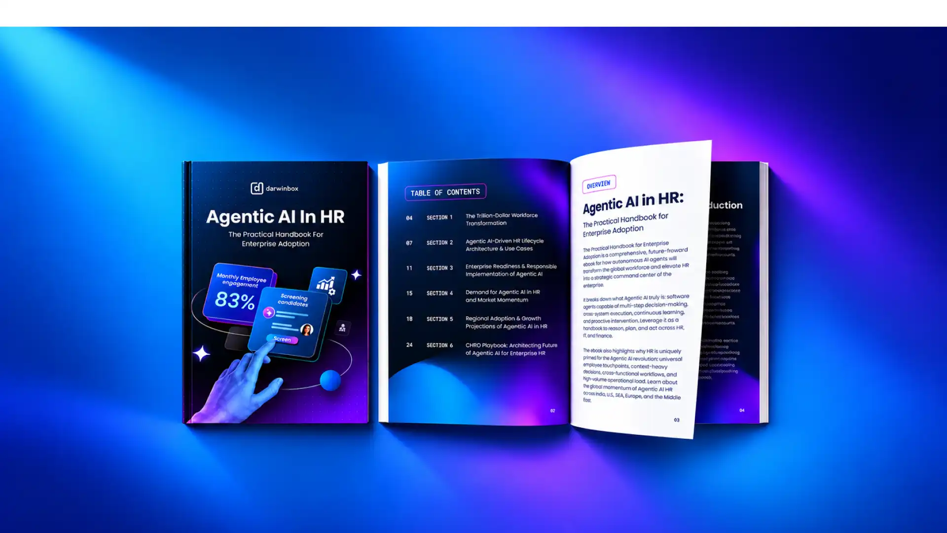
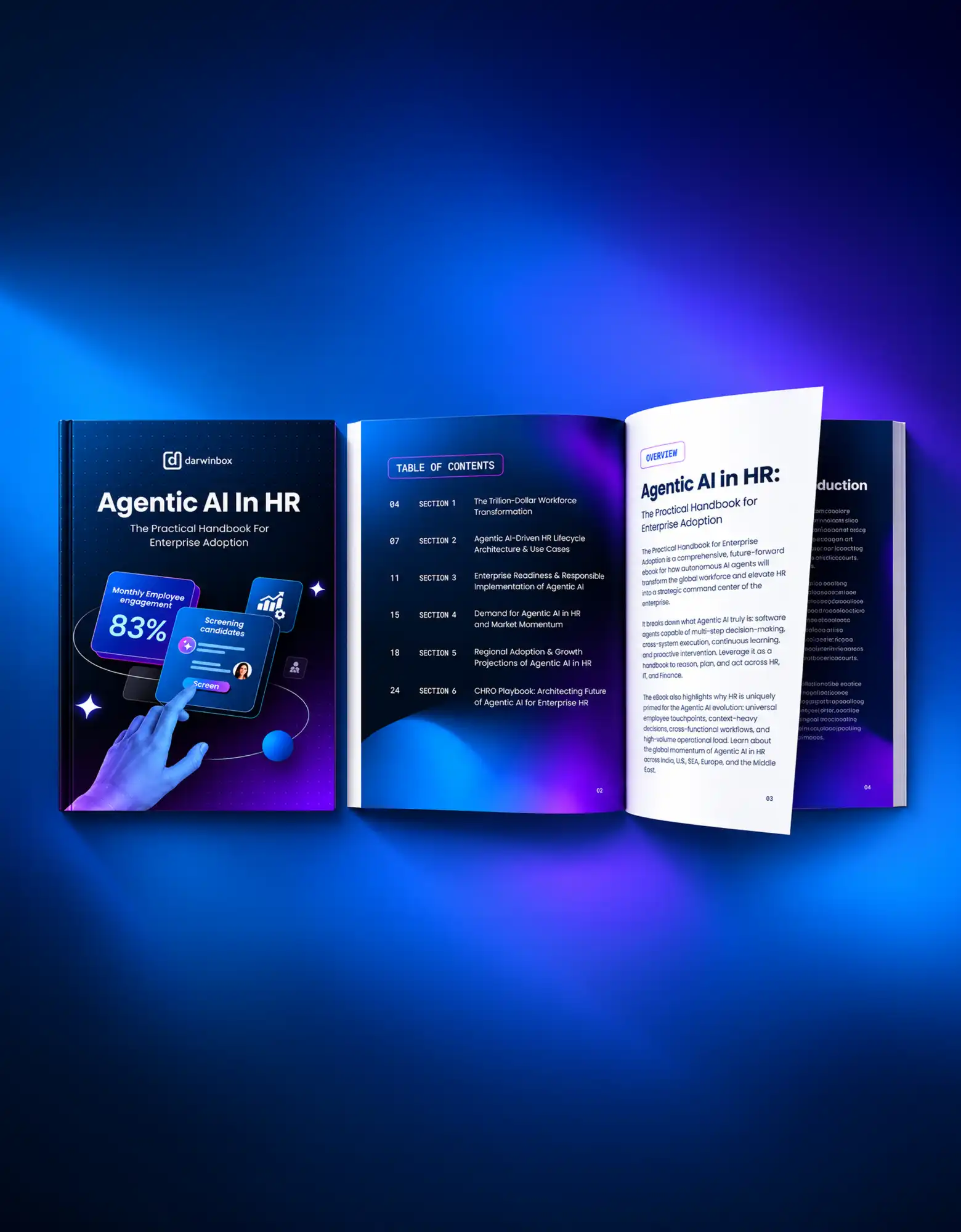
An ebook can use larger headings, shorter content sections, illustrations, photography, pull quotes, statistics, icons, diagrams, highlighted takeaways, branded graphics, and stronger transitions between sections.
The layout can encourage scanning rather than demanding continuous reading from beginning to end.
CTAs can also be integrated more naturally throughout an ebook. Depending on the content goal, readers might be directed toward a related guide, product page, consultation, newsletter, demo, or another stage of the customer journey.
This creates one of the biggest differences in ebook vs whitepaper design: perceived reading effort.
A 20-page ebook with strong hierarchy and visual variety may feel easier to consume than a 10-page whitepaper filled with dense paragraphs, technical tables, and detailed references.
That perception matters before someone even starts reading.
The cover, landing page, page count, content preview, layout, and positioning all influence whether the resource feels like a quick practical guide or a serious research document requiring focused attention.
Neither experience is automatically better.
The right design depends on what the audience expects.
For a broad marketing audience, accessibility and visual engagement may build trust by making complex information approachable. For a specialist audience, a more formal presentation may communicate seriousness and depth.
The strongest design therefore does not simply make the document attractive. It reinforces the role the content is supposed to play.
There is no universal winner in the ebook vs whitepaper conversion debate.
Conversion depends on what is being measured, who the audience is, how the resource is promoted, what information is requested in exchange for it, and what action the business wants the reader to take.
An ebook can be more suitable for top-of-funnel lead generation because it generally presents a lower-friction proposition.
A reader encountering a new brand may be more willing to download a practical guide, checklist-style resource, or educational ebook than commit to reading a highly technical research document.
The visual structure can reinforce that accessibility.
Clear chapter divisions, prominent takeaways, illustrations, diagrams, and scannable layouts allow readers to understand the value quickly. This makes ebooks particularly useful when the goal is to introduce a topic, educate a broad audience, or generate interest before a prospect is ready for detailed product evaluation.
Whitepapers can become more valuable as the audience becomes more specialized or the buying decision becomes more complex.
A technical decision-maker evaluating an enterprise platform, for example, may actively want detailed methodology, research findings, benchmarks, technical explanations, or evidence supporting a company’s point of view.
In that context, greater information density is not necessarily a disadvantage. It can be part of the value proposition.
This is why asking only “Which format gets more downloads?” can be misleading.
A resource generating 1,000 early-stage leads is serving a different purpose from one generating 100 highly relevant conversations with technical or enterprise decision-makers.
The better question is: what kind of conversion does the business need?
If the objective is broad awareness, email acquisition, education, or moving unfamiliar audiences into the funnel, an ebook may be the more appropriate format.
If the objective is establishing authority around a complex subject, supporting detailed evaluation, presenting research, or influencing a more technical B2B audience, a whitepaper may be stronger.
The format alone will not create those results. Topic relevance, distribution, landing-page experience, brand credibility, content quality, form friction, and follow-up strategy all influence performance.
Design then helps ensure that the chosen format meets the expectations created around it.
That is the more useful way to approach whitepaper vs ebook design: not as a competition between two document types, but as a decision about which reading experience best supports the audience, content, and conversion goal.
Choosing between an ebook and a whitepaper becomes easier when you start with the audience rather than the format.
Different readers have different expectations around depth, tone, evidence, and presentation. A resource that feels accessible and useful to a small-business owner may feel too lightweight to a technical enterprise buyer. Similarly, a highly detailed research document may provide credibility for one audience while creating unnecessary friction for another.
For B2C and SMB audiences, ebooks are often a natural fit.
These readers may be looking for practical education, inspiration, step-by-step guidance, comparisons, or solutions to a specific problem. An ebook can break that information into shorter sections supported by illustrations, diagrams, examples, highlighted statistics, and actionable takeaways.
The format works particularly well when readers need to understand the subject quickly rather than evaluate extensive technical evidence.
Enterprise and research-driven B2B audiences can have different expectations.
When a purchasing decision involves multiple stakeholders, significant investment, technical complexity, security considerations, or long evaluation cycles, detailed evidence can become more important. A whitepaper provides room for research, methodology, technical explanations, benchmarks, references, and supporting data.
That does not mean every B2B company needs whitepapers or every consumer brand needs ebooks.
Audience sophistication matters more than the industry label alone.
A SaaS company could create an introductory ebook for marketing managers and a technical whitepaper for IT leaders evaluating the same platform. Both documents may discuss similar subject matter while changing the depth, language, evidence, and design for each audience.
Some brands can therefore use both formats within the same content ecosystem.
The ebook introduces and simplifies the subject for a broader audience. The whitepaper provides deeper evidence for readers who progress toward evaluation.
In an ebook vs whitepaper decision, the better format is the one that matches what the intended reader expects at that point in the buying journey.
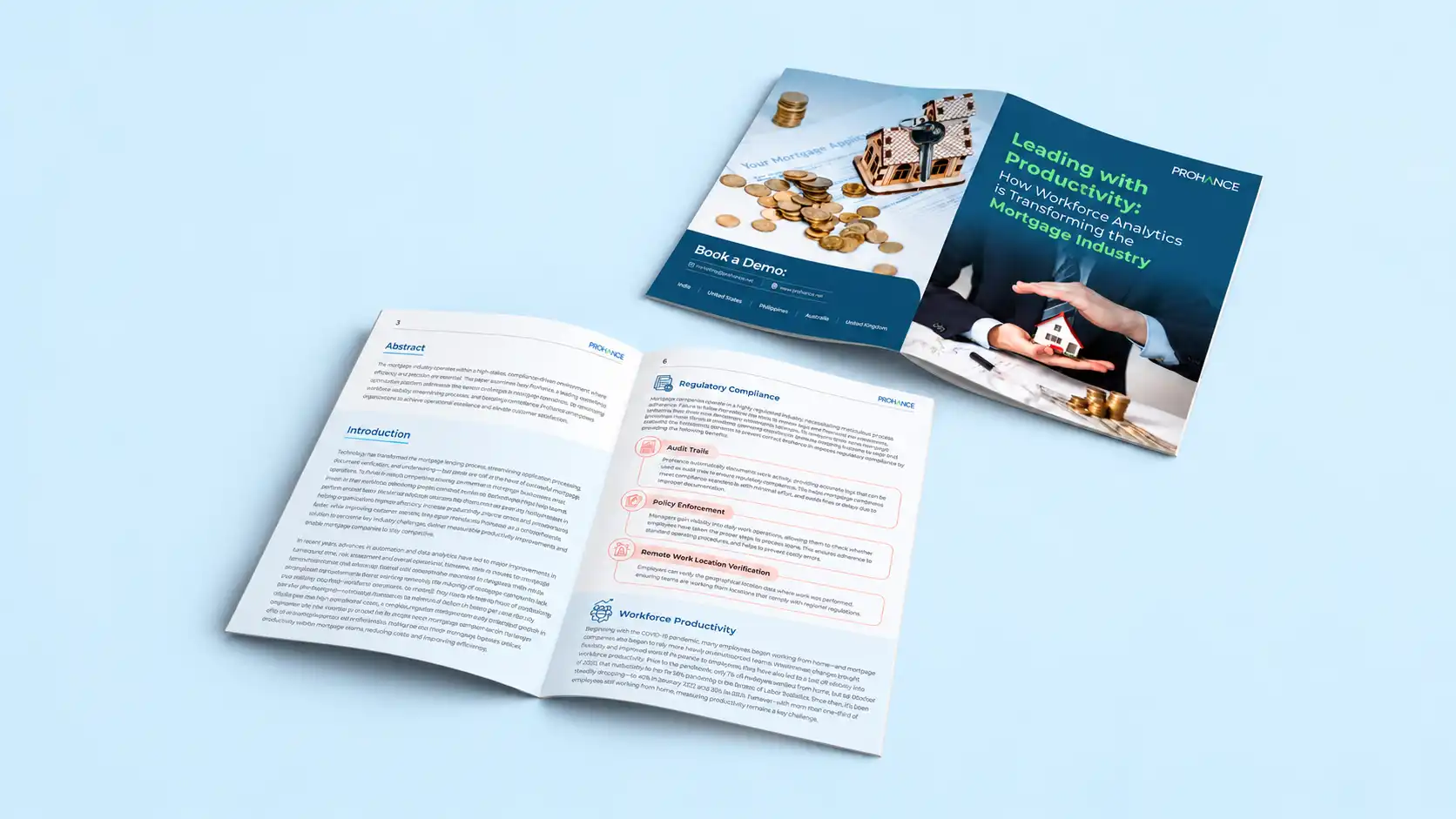
A whitepaper needs to communicate authority without becoming visually exhausting.
Because whitepapers frequently contain research, long-form explanations, citations, charts, tables, and technical information, designers have less freedom to solve readability problems simply by reducing the amount of content.
Instead, the layout needs to organize complexity.
Start with typography. Body copy should remain comfortably readable across multiple pages, while headings and subheadings should create obvious entry points into longer sections. Paragraph lengths, line spacing, margins, and white space all affect whether a dense document feels manageable.
The visual system can remain restrained without becoming monotonous.
Rather than filling pages with decorative imagery, whitepaper design can use section openers, key-statistic callouts, pull quotes, tables, diagrams, and carefully placed data visualizations to create rhythm.
Charts are particularly important.
A whitepaper containing valuable research can lose credibility if its data is presented through confusing graphs, inconsistent styling, unreadable labels, or unnecessary visual effects.
Data visualization should make the evidence easier to interpret.
Use clear labels, consistent chart conventions, sufficient contrast, and visual emphasis that directs attention toward the relevant finding. Brand colors can help create hierarchy, but they should not distort or obscure the underlying information.
Charts should support the argument rather than decorate the page.
The same principle applies to imagery. If photography or illustration does not add meaning, it may not be necessary. A formal document can rely primarily on typography, information hierarchy, and data while still feeling professionally designed.
Branding should also remain visible.
A whitepaper does not need to resemble an academic paper simply because the subject is serious. Typography, colors, graphic elements, diagrams, and page structure can still reflect the company’s broader visual identity.
The strongest whitepaper design balances three priorities: authority, readability, and brand consistency.
Ebooks usually provide more opportunities to create an active visual reading experience.
Readers may not consume an ebook from the first page to the last in one sitting. They may scan the table of contents, jump between sections, look for highlighted advice, or return later to a particular framework.
The design should support that behavior.
Strong visual hierarchy is therefore essential.
Clear chapter openings, prominent headings, short sections, highlighted statistics, callout boxes, illustrations, diagrams, icons, and pull quotes can help readers understand the structure without reading every paragraph.
Imagery can also play a larger role than it typically does in a whitepaper.
Photography, illustrations, product visuals, screenshots, diagrams, or branded graphics can break up longer sections while reinforcing the company’s visual identity. These elements should still serve the content rather than simply filling empty space.
Another important difference between ebook and whitepaper design is CTA placement.
An ebook created for lead generation does not have to wait until the final page before giving readers a next step.
Relevant CTAs can appear naturally after sections where the reader has already received useful information. Depending on the business and funnel stage, that next step might be exploring a related service, reading another resource, subscribing for updates, viewing a product, requesting a demo, or contacting the company.
Frequency should be intentional rather than excessive.
If every few paragraphs contain a promotional message, the ebook can quickly stop feeling educational. The CTA should feel like a logical continuation of the reader’s journey.
Mobile and screen-based reading should also influence ebook design. Complex multi-column layouts, tiny captions, and overly detailed graphics may look impressive on a large design canvas but become difficult to consume on smaller screens.
Testing the final document at realistic viewing sizes is therefore important.
Our complete ebook design guide covers the broader principles behind building an effective ebook, while the ebook CTA and layout checklist provides more detailed guidance for structuring pages and conversion points.
Ultimately, ebook design should make useful information feel easier to navigate and act on.
That is one of the clearest distinctions in whitepaper vs ebook design. A whitepaper often needs to organize depth and reinforce authority. An ebook typically has more freedom to simplify, visualize, guide, and encourage interaction.
Neither approach is inherently more effective. The design should reflect what the reader needs from the content and what the business wants that reader to do next.
The ebook vs whitepaper decision should not begin with page count or visual preference.
Start with three questions: where is the audience in the funnel, what level of formality do they expect, and how much depth does the subject genuinely require?
1. Consider the Funnel Stage
First, define what the content needs to achieve.
If the primary goal is awareness, education, lead generation, or introducing a complex topic to a broad audience, an ebook is often the more practical format.
Its structure can make information feel approachable. Shorter sections, strong visual hierarchy, illustrations, highlighted takeaways, and strategically placed CTAs can help readers move through the content without committing to a highly technical read.
This makes ebooks particularly useful when the audience is still exploring a problem rather than actively evaluating a specific solution.
Further down the funnel, the requirements may change.
A potential buyer comparing enterprise solutions may want evidence rather than introductory education. Original research, technical explanations, detailed methodologies, benchmarks, or industry analysis may carry more value at this stage.
A whitepaper can provide the depth and formal presentation needed to support that evaluation.
The distinction is not absolute. An ebook can influence a later-stage buyer, and a whitepaper can attract new prospects. Funnel stage should guide the decision rather than become a rigid rule.
2. Consider Audience Expectations
Next, ask what type of content your audience considers credible.
A small-business owner looking for practical marketing advice may prefer a visually structured ebook that can be scanned quickly. A cybersecurity specialist evaluating a technical approach may expect significantly more detail, evidence, and documentation.
This is where the difference between ebook and whitepaper becomes particularly important.
Do not choose a whitepaper simply because it sounds more authoritative. If the content does not contain enough evidence or depth to justify the format, calling it a whitepaper will not automatically make it credible.
Likewise, do not choose an ebook simply because it allows for more visual design. If the audience expects rigorous analysis, excessive simplification can weaken the usefulness of the resource.
The format should match the reader’s expectations before design begins.
3. Consider the Depth of Existing Content
Finally, look at the material you already have.
Do you have original research, proprietary data, survey findings, detailed technical analysis, or a well-supported argument? That material may naturally lend itself to a whitepaper.
Do you have a practical framework, educational series, collection of insights, step-by-step process, or broad guide? An ebook may provide a better structure.
Avoid artificially expanding content simply to make it feel substantial enough for a whitepaper.
Similarly, valuable long-form material should not automatically be compressed into a highly visual ebook if doing so removes the evidence and detail that make the content useful.
The content should determine how much depth is necessary. Design should then make that depth easier to consume.
A simple decision framework is:
There is also a fourth option: use both.
If the underlying subject is valuable to audiences at different stages, the same research can support multiple content assets.
For example, original research could become a detailed whitepaper for technical decision-makers. The most useful findings could then inform a shorter, more visual ebook designed for a broader audience. Individual insights could also become social posts, articles, charts, sales materials, or presentation content.
The objective is not to duplicate the same PDF with a different cover. Each version should be adapted to the information needs and expectations of its intended audience.
That is ultimately the most useful answer to ebook vs whitepaper.
Neither format inherently converts better.
An ebook may be more effective when the business needs accessible education, broad lead generation, visual storytelling, and clear pathways toward another action. A whitepaper may be more effective when the audience values research depth, technical credibility, evidence, and detailed evaluation.
Conversion comes from matching the right content, format, design, offer, and audience—not simply choosing the document type that appears to perform best elsewhere.
Once that decision is made, design becomes responsible for delivering on the expectation.
An ebook should feel approachable without becoming superficial. A whitepaper should feel authoritative without becoming difficult to read. Both should reflect the brand, communicate information clearly, and provide an appropriate next step.
For deeper execution guidance, explore our complete ebook design guide and ebook CTA and layout checklist. If you need a long-form content asset turned into a clear, branded, and professionally structured publication, Abstrct’s ebook design services can help translate the content into a reading experience built around your audience and business objective.
Professional design still matters for whitepapers — even within a more formal, conservative visual approach, clear hierarchy and readable data visualization significantly affect whether the document gets read.